Erhalten Sie Zugang zu diesem und mehr als 300000 Büchern ab EUR 5,99 monatlich.
- Herausgeber: IMM Lifestyle Books
- Kategorie: Lebensstil
- Sprache: Englisch
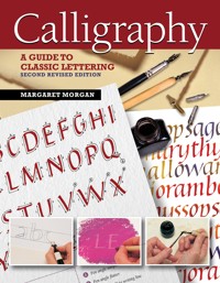
If you've ever wanted to learn the techniques of hand lettering, Calligraphy gives practical advice and guidance on materials, tools, and proper methods. Containing four alphabets and 12 step-by-step projects, you'll be able to create stunning cards, calendars, letterheads, and wall hangings. Author and professional lettering artist Margaret Morgan will provide you with all the essential skills you need to enjoy and thrive in the beautiful art of calligraphy!
Sie lesen das E-Book in den Legimi-Apps auf:
Seitenzahl: 121
Veröffentlichungsjahr: 2020
Das E-Book (TTS) können Sie hören im Abo „Legimi Premium” in Legimi-Apps auf:
Ähnliche


Published 2001, 2020—IMM Lifestyle Books, an imprint of Fox Chapel Publishing
IMM Lifestyle Books are distributed in the UK by Grantham Book Service, Trent Road, Grantham, Lincolnshire, NG31 7XQ.
In North America, IMM Lifestyle Books are distributed by Fox Chapel Publishing, 903 Square Street, Mount Joy, PA 17552, www.FoxChapelPublishing.com.
© 2001, 2020 by Margaret Morgan and Fox Chapel Publishing Company, Inc.
The projects, templates, and exemplar alphabets contained herein are copyrighted by the author. Readers may make copies of these items for personal use. The items themselves, however, are not to be duplicated for resale or distribution under any circumstances. Any such copying is a violation of copyright law.
All illustrations and lettering by the author. All photography by John Freeman unless otherwise noted. Photos by the author: pages 19, 20, 33, 97, 98, 99 top left, and 101 bottom. The following images are credited to Shutterstock.com and their respective creators: white paper texture 2–5, 34–49, 55–56 by YamabikaY; chair 15 by Aleksandr Kurganov; nibs 17 by timquo; paper 23 by Anna K Mueller.
Print 978-1-5048-0113-3
eISBN 978-1-6076-5724-8
Library of Congress Control Number: 2019947162
We are always looking for talented authors. To submit an idea, please send a brief inquiry to [email protected].
This book has been published with the intent to provide accurate and authoritative information in regard to the subject matter within. While every precaution has been taken in the preparation of this book, the author and publisher expressly disclaim any responsibility for any errors, omissions, or adverse effects arising from the use or application of the information contained herein.
About the Author
Margaret Morgan is a freelance calligrapher with over 30 years’ experience. She has taught workshops both at home and abroad since 2001, including in Germany, Norway, Japan, and the United States. Originally trained in graphic design and typography, she worked in a variety of fields, including advertising, display, and packaging, before turning her attention to calligraphy full time. Her work is in both private and public collections, notably the Internatioxnal Calligraphy Archive in Berlin, Germany. She is a Fellow of the Calligraphy & Lettering Arts Society and a full member of Letter Exchange in the UK.
Acknowledgments
Grateful thanks to the following for providing the materials for photography: Daler Rowney Ltd, Winsor & Newton, L Cornelissen & Son Ltd, Falkiner Fine Papers, Cowling & Wilcox. Thanks also to friends and calligraphic colleagues who have guided and encouraged me over the years, especially my patient and understanding husband.
Contents
Getting Started
Introduction
A brief history of Western calligraphy
Equipment overview
Setting up your studio
The specifics
Paper
Making your mark
Basic Alphabets
Roman capitals
Foundation hand
Italics
Versals
Practice Projects
Alphabet broadsheet
Words as patterns
Design skills
Developing Projects
Letterhead with monogram
Greeting card
Menu and matching place cards
Combining text and translation
Multilingual calendar
Additional Techniques and Projects
Additional techniques
Christmas card
Gilded and decorated letter
Alphabet and gilded A–Z
A magic carpet: gilding with color
Glossary
Suppliers and Resources
Introduction
Lettering is fun! This book is aimed at beginners as well as those with some experience of wielding a broad-edged pen. It gives you the information and examples needed to help you write several different scripts well, and then goes on to introduce the use of design in simple calligraphic projects. Once you have mastered the basic skills of good letterforms, there are many exciting techniques to explore, both traditional and modern, within these pages.
Since the widespread use of computers and handheld devices have taken over so much of our written communications, it does no harm at all to reexamine the historical origins of the letters we see and use every day. Look carefully at how those familiar 26 letters are made, following four specific traditional styles, then take courage and go forward with experiments of your own. Open your eyes to other cultures too; other, less familiar influences, with their different ways of using color and design than your own, can open up new horizons and spark off ideas to explore.
My involvement with calligraphy started early. Learning italic handwriting at the age of eight and a Christmas gift of a set of broad-edged Mitchell nibs are what got me hooked. I studied graphic design and typography at art college (letters again!), which formed the major part of my professional work for more than twenty years. However, those edged pens were never far from my hand, and calligraphic work eventually took over my time completely towards the end of the 1990s, which gives me great satisfaction. That art training, backed up by continuing regular study with well-regarded international lettering artists, has been invaluable for extending the creative possibilities for the many gifts and cards using letters that I have made over the years.
Calligraphy: A Guide to Classic Lettering gives you a glimpse of what is possible with pen, paper, inks, and paints, with a little time, patience, and enthusiasm. You may find, as I have, that your interest goes beyond the hobby stage and will stay with you forever.
Margaret Morgan
A Brief History of Western Calligraphy
The history of calligraphy, like many other histories, is cyclical: a new writing style is born, developed, and eventually dies or goes out of fashion; this is followed by rediscovery, reappraisal, and further improvement. What follows is just a general outline of how our current letterforms came into being.
roman capitals
Our familiar Western letterforms mostly stem from the Roman capitals (or majuscules) of the early centuries AD. These capitals were used for important and formal inscriptions. It is generally believed that the letters were first painted with a square-edged brush, then cut into a V-section in stone. The pattern of thick and thin strokes shows the calligraphic influence of the tools used to make them and the angle at which the tools were held. They weren’t “everyday” letterforms, though, as they required care and precision in the making. Square and rustic capitals fall into the same category. These early book hands were used for writing out classical texts. They were slow to write and required much pen manipulation to achieve the shapes—not natural pen-written forms at all.
Scribes gradually modified the capitals to economize on effort for the sake of speed; they took notes with their metal styli onto wax tablets, and, gradually, a cursive or running hand evolved. These tablets could be smoothed over and reused after the text had been transferred to a more permanent form, such as with reeds or quills on papyrus.
ROMAN CAPITALS
RUSTIC CAPITALS
SQUARE CAPITALS
uncials and half uncials
Between the 4th and 8th centuries AD, uncials developed out of the old Roman cursive hand, for writing out Christian texts. The forms were rounded, written with a slanted pen at a shallow angle, and showed the first real suggestion of ascenders and descenders. These are the first true pen-made letters, the shapes being created by the nature of the tool, not by trying to imitate anything else. They are clear, simple, and legible, and continue to provide inspiration to modern calligraphers. Later forms were written with a flat pen angle.
The spread of Christianity had much to do with the next development of written forms. The Roman Empire began to decline into chaos, incessant wars caused further difficulties, and much “pagan” classical literature was lost during the period we call the Dark Ages (550–750 AD). Cultural life in Europe more or less ceased as barbarians invaded and care of books and teaching passed to the care of the church. Half uncials developed independently during this time in Ireland and England from early examples of Roman uncials; they show clear ascenders and descenders. The most famous examples of the different types of “insular” half uncials can be seen in the Irish Book of Kells and the English Lindisfarne Gospels.
UNCIALS
UNCIALS WRITTEN WITH A FLAT PEN ANGLE
HALF UNCIALS
carolingian minuscules
The Age of Charlemagne was another important milestone. The Emperor Charlemagne was passionate about books and learning. His ambition was the revival of cultural life, for which books were essential. In 789 AD he decreed that all liturgical books should be revised. The Carolingian hand is characterized by a clear fluency and legibility that was ideal for these book texts. It was combined with the majuscules (built-up Roman letters, rustic capitals, and unicals) of antiquity, which were used for chapter headings, sub-headings, and the beginnings of verses—the hierarchy of scripts scribes still use today.
An English version of this hand was developed as an almost perfect model for formal writing—strong forms, logically made, with a consistent pen angle and easily read.
CAROLINGIAN MINUSCULES
CAROLINGIAN ENGLISH
gothic
By the 12th century, letterforms were becoming more and more compressed, and the soft flow of Carolingian gradually gave way to the heavy, angular, black letters of northern Europe known as Gothic. Materials became more expensive as demand for books increased, so the need to economize was greatly helped by the narrow Gothic letters that took up a lot less space but which were harder to read.
There were regional variations of the style across the European continent: the northern European quadrata had diamond feet and was very angular; rotunda, used in Spain and Italy, was much rounder in form; and the precissus Gothic of English manuscripts was characterized by its flat feet.
GOTHIC HAND
PRECISSUS
ROTUNDA
QUADRATA
the renaissance
SQUARE CAPITALS
During the Renaissance period in Italy (c. 1300–1500), there was a resurgence of interest in classical literature, and Italian scribes rediscovered the Carolingian minuscule. They also studied the Roman inscriptional letters and Bartolommeo San Vito revived the use of square capitals, developing his own distinctive style. Humanist minuscules, closely based on Carolingian, with their rounded forms, were very legible, dignified, and perfectly suited to formal texts.
HUMANIST MINUSCULES
What we now call italics also emerged at this time. Written with a slight slant and fewer pen lifts, italics were oval in form and flowed elegantly and relatively swiftly from the pen, making them ideal for secretaries writing documents at speed. Italics eventually evolved into copperplate script, where thicks and thins are made by applying degrees of pressure to a pointed nib, a move away from true pen-written forms.
HUMANIST ITALICS
calligraphy in modern times
Printing with movable type was invented around the mid-15th century, but printing didn’t entirely destroy the art of penmanship. Letters, patents, and diplomas were still produced in the traditional way. However, much of the craft fell out of use for almost two centuries, until William Morris rekindled interest in pen-lettering for the Arts and Crafts movement in the 19th century. Morris championed the cause of the craftsman-made objects in an age of increasing mass production, putting his studies of old manuscripts to good use when he set up his Kelmscott Press in 1890 in order to print beautiful and individual books. The real breakthrough for calligraphy came with the researches of Edward Johnston during the early part of the 20th century. His painstaking work brought about the rediscovery of broad-edged nibs and their importance in the development of the Western alphabet. His influence spread throughout Britain and into Europe in the 1940s and 50s, as well as to the United States.
Equipment Overview
The very basic requirements for creating letterforms are pen, pencil, ink, paper, and a drawing board, but before long you will probably want to add other items to your toolbox, such as some of those listed in the following pages. You will need some of these extra items in order to complete all the projects in this book. Buy these items gradually, getting the best you can afford, which will pay dividends over time. Good equipment not only gives satisfaction in use, but, as long as it is properly looked after, will last for many years.
essential equipment
To start practicing calligraphy, you will need just a small toolbox of essential equipment.
Brushes: Load nibs and mix paints with inexpensive brushes; keep the best quality sables for fine finished work (see page).
Dip pens: A dip pen consists of a pen holder that can be fixed with nibs of various sizes and ink reservoirs, if required (see page and page). It can be used with ink or paint (see page).
Drawing board: You will need a board at least 16” x 23” (A2 size/420 x 594mm), preferably larger, to work on. Instead of buying a board, you can easily make your own, quite cheaply, from an offcut of medium-density fiberboard (MDF) (see page).
Ink: Use non-waterproof ink bought in bottles (see page).
Masking tape: A low-tack masking tape should be used to attach paper to the drawing board surface; it can be removed easily.
Metal ruler or straight edge: This should be used for cutting paper or cardstock with a scalpel or craft knife; a plastic ruler will be quickly damaged by sharp scalpel blades.
Paper: You will need a variety of papers, depending on the nature of the project, as well as layout and tracing paper to make roughs (see page).
Pencils: Have a #2 (H or HB) pencil handy for ruling lines (see page).
Plastic eraser: This should be soft enough not to smudge or spoil lettering.
Transparent ruler: An 18” (45cm) clear plastic ruler will be the most useful for ruling lines because you can see your work through it.
useful additions
These additions to the basic toolbox will be necessary as you progress from the early writing exercises to working on the projects
Bone folder: This specialty tool is used for scoring and folding paper and is available from suppliers of bookbinding materials, as well as at larger local craft stores.
Compasses and dividers: You will need these to draw circles and mark points for ruling lines. Springbow dividers have a central screw to retain a set measurement.
Cutting mat: This is a special mat made from “self-healing” rubber that does not blunt or damage scalpel or craft knife blades. Thick cardstock is a cheaper, temporary alternative.
Knife: A scalpel with disposable blades should be used for trimming out finished work. A pointed blade is best for this, but scalpels have different blades for different applications. Use a craft or Stanley knife for heavy cardstock, as the stronger blades will withstand the extra pressure required without snapping. Both knives are useful for sharpening your pencils to a really sharp point.
Paint: