20,39 €
Mehr erfahren.
- Herausgeber: CICO Books
- Kategorie: Lebensstil
- Sprache: Englisch
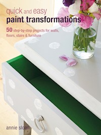
With this book in one hand and a brush in the other, you can learn how to create different finishes and effects with paint to change everyday rooms and furnishings into something special, all for the price of a pot of paint. The first section of the book tells you everything you need to know before you start - how to prepare surfaces properly, choose the right paint for the right place, use the best tools and select a colour scheme that will work with the room in question. 50 different techniques follow, with step-by-step photos showing you how to achieve the finished look, accompanied by inspirational photos showing the effect used on walls and doors, furniture and floors. Learn how to update old secondhand furniture, or how to give modern pieces a softly-aged appearance, all with the aid of a pot of paint and a brush. Whatever the style of your interiors, Quick and Easy Paint Transformations will show you the best way to makeover your home.By leading the decorative painting revolution over the last 20 years, Annie Sloan has become perhaps the world's most respected expert in decorative paint, colours, and techniques. Alongside her unique and versatile decorative paint, Chalk Paint, Annie has inspired generations with her accessible, lively, and creative approach to getting great results.
Das E-Book können Sie in Legimi-Apps oder einer beliebigen App lesen, die das folgende Format unterstützen:
Veröffentlichungsjahr: 2014
Ähnliche


Introduction
Painting furniture is a tremendously rewarding experience
When I begin a piece of work, I usually have a very vague idea of what I want to do—the color probably, and some broad idea of the technique—but I don’t have a really firm idea of the end result. I think it is very important to react to the piece of furniture and not have a plan that you follow rigidly. It is quite acceptable to change your mind because as you paint, the furniture starts to tell you what it wants and needs. The age, texture, and color of the wood, plus the shape and style of the furniture, are all determining factors in how you will paint it. As the first coat goes on, characteristics start appearing and you will begin to have ideas that might differ a little from the original plan. Part of the fun is working with the new inspiration and it is this that will make the piece unique.
Another of my guiding principles is that I also want to paint a piece quickly. Like everybody, I’m busy with lots of activities, so I stop working when I find that I am laboring over something. If I can’t think of anything to do to a piece immediately I will take a break, sleep on it, and come back to it fresh the next day. Sometimes just leafing through some magazines or books, rather than thinking directly about the project, provides me with inspiration.
What starts it off?
I want my piece of furniture to have at least a nodding acquaintance with the past—with old painted furniture from the 18th century or the early 20th century—but I don’t want to copy the original techniques exactly. I love 18th-century French, Swedish, and the less fancy Italian painted furniture and I continually make reference to them, but I also adore the crazy, bohemian, expressive artists from the Bloomsbury Group, painting furniture in their Charleston farmhouse during the 1930s. I want to make a unique piece that has character and individuality so I borrow ideas from how old furniture looks now and use my versatile paints to create something new. My take on furniture painting is to look at all the old pieces, remembering that wonderful patina of old age, and then start painting, allowing the furniture to “speak” and let a hint of the random enter the work.
Beauty in imperfection
I do not aim for faultlessness in my work after seeing the most charming piece of painted furniture I had ever set eyes on in the Doge’s Palace in Venice—a captivating découpage cabinet built in the 18th century. None of its lines were straight or measured and the paper cut outs were not completely stuck down. It was dark in some places, faded in others, and worn in parts, but the sum of these inconsistencies was a certain sort of perfection. This was a lesson for me. Of course I don’t want furniture to look rough and uncared for either and there is a fine line between distressing and destroying. Part of the ability to achieve this look is learning to work with color.
Color choices
Color combinations are probably the most important thing to get right. Hard contrasts, lots of colors without an anchor, too many hot colors, or too many same-toned colors are all things I try to avoid when working. If you are not confident with color a good rule is to try using just two colors, or three at the most. It is best if they are different tones, with a middle note or tone for most of the piece and a light and a dark tone for a high note and a base. The fashion at the moment is for pale colors with some joyous color in parts. Maybe your furniture could be the colorful highlight in the room. Or paint the wall in a strong color and have the furniture light and subtle.
Choosing the furniture
Use decent furniture to begin with. Don’t try painting a tea trolley and expect it to look like it came from a French château. The furniture just has to be the right shape, so reproduction pieces are perfect. Don’t be put off by furniture that has a bad finish or small pieces missing, but don’t get carried away as replacing too much can be time consuming, dull, and frankly not worth it unless the piece is really exceptional. Wood glue will stick down lifted veneer and loose molding, and plaster can fill gaps. Remember that paint will hide water- damage stains and horrible colored wood. Using my paint (see Paint colors) means I do not usually have to rub down the piece of furniture or prime it, so I can just get stuck right in and start doing the interesting bit.
Enjoy, enjoy, enjoy!
tools and materials
PAINT
Make sure you get the right paint for the job. This will open up a lot of possibilities and make painting your furniture a pleasant experience, because the paint will be responsive and you will be able to work in a practical flexible way. There are many house paints on the market but I believe that my purpose-made paints (see pages 154–155) are the best for the projects in this book. They have been specially created to be used in a whole variety of ways—for example, as a wash, with or without texture, or applied thickly. The paint has a very matt texture and absorbs wax easily, plus you don’t have to prime the furniture or rub it down in preparation, meaning you can start painting easily and quickly while you have the urge. The paint, despite being water based, even mixes easily with the solvent-based wax too, so you can color the final finish to get the exact color you want to achieve. For the most part with my chalk paint you only need to apply one coat, but where two coats are necessary apply the first one with a big brush.
COLOR
Working with a good palette of colors is important, as is being able to mix them. I use a palette of ready-mixed neutrals with stronger colors, working on the premise that you can lighten strong colors but can’t make a light color strong. My already-aged colors, such as Duck Egg Blue, can be lightened with Old White, but for colors like Provence, which is rather clean, it might be better to add Country Grey to dull it and give it a little complexity. Of course, waxes can change the color too, so take this into consideration when you are applying your chosen paint. Color is extraordinary because it changes so much according to the context within which it is used—a color that looks great in one room could look like dirty pondwater in another because of light (either artificial or natural) and the surroundings. Don’t worry if your initial choices do not give the effect that you hoped for—with the methods in this book you can change the tone and color of a piece using washes and colored waxes.
BRUSHES
Your brush does not have to be expensive, but it does need to have certain qualities because working with bad brushes can be very detrimental. I find that using a brush that is a mix of synthetic and bristle is the best. The hairs should be fairly long and flexible with a little bounce to allow you to be expressive in your work.
I don’t usually like to have a list of “do nots” but this one seems useful and may help to highlight any possible problems:
Don’t work with brushes that are too short since the paint will not flow well.
Don’t use a brush with hard and inflexible bristles, because the paint will look scratchy.
Don’t have a floppy brush, because you will have to work too hard to make the paint spread.
Don’t use a really cheap brush because the hairs keep coming out and that is just plain annoying!
Don’t work with just one rather small brush since this quickly becomes tedious. Have a collection of brushes to hand, such as a large one at least 3–4in (7.5–10cm) wide for painting onto the furniture with speed and a smaller 1–2in (2.5–5cm) brush to get into the intricate parts, including moldings and corners. In the projects in this book, I tend to work with a 2in (5cm) and 1in (2.5cm) brush, but pick a size that feels comfortable for you to use.
Waxes, sandpaper, varnishes, and cloths
I wax more or less everything I paint to get the right finish for my furniture and walls. I find it makes my projects strong and practical and gives them a beautiful workable finish. I recommend that you choose a soft wax that can be applied easily with a brush. I generally use a 1in (2.5cm) brush in the projects to apply wax, but you can use a large brush to get it done quickly if it feels more comfortable. After adding a layer of clear wax to a piece, you can then start applying dark wax or coloring the clear wax with some of my paint to alter the finish. For the whole distressed look you need to be able to sand the waxed surface to reveal the wood or another coat of paint—have a range of fine-, medium- and coarse-grade sandpapers for this purpose. I tend to find using just the fine- and medium-grades is enough, but sometimes move onto the coarser paper if I really want to distress the furniture. The only time I use varnish is on floors, when I am doing découpage, and when I use the crackle varnish set. I prefer to apply wax to my work at the end because it has such a soft finish, can be colored and changed as you work, and stops the work chipping. Finally, have a good supply of cloths so you can wipe brushes, polish wax, apply and wipe off paint, and generally use them to clean. I use old sheets from thrift stores and charity shops and they seem to be able to provide me with an endless supply.
distressed pine table
using two colors distressed
This is a simple, smooth piece of pine furniture and I felt it needed a quiet look so it could be used as a side table. I decided on Old White and Versailles since these two colors are close in tone.
My attitude to painting is to finish it quickly and get the job done, so don’t mess about with little brushes. Use as big a brush as you can cope with and don’t worry if the paint spreads wider than you think you want it to. When you distress pine, the unwanted color can be removed even if it does go back to the wood.
Before
The table’s best features are its legs so I decided to give them more focus by highlighting parts of these and the table edging.
You will need
Old White paint1in (2.5cm) paintbrush for applying paintVersailles paintTin of clear wax2in (5cm) paintbrush for applying waxCloth for removing excess waxFine-grade sandpaperTIP Start the painting with the table turned upside down. If you paint it the right way up, then you will keep discovering bits you have missed.
Step Step 1
Old pine that has been stripped, like this piece of furniture, can be quite a dark yellow or even orange, so it will probably need at least two coats of a light colored paint. I chose to paint the whole table in Old White first, even the parts that will later be painted in Versailles.
Step Step 2
The indented legs are the highlight of the table. Using a 1in- (2.5cm-) wide brush, dab and pull the Versailles paint along the molding. Don’t load the brush up with too much paint or have it too runny, otherwise it will drip. In order to achieve an even finish it’s best to get the right amount of paint on each side of the leg, rather than try to do all four sides at once with the same paint load. Don’t worry if some paint goes on an area you want to remain white—the paint will not be thick so you can leave it and remove it later.
Step Step 3
The edges of the table top are simple, and it’s tempting to use a really small brush on these narrow parts, but use a slightly larger one to speed things up.
Step Step 4
Wax the table before smoothing and rubbing with sandpaper to remove some of the paint. I prefer to work by waxing a smallish but defined area, such as the edge of the table or the table top, rather than waxing the whole piece of furniture. After waxing, wipe the area with a cloth to remove any excess wax.
Step Step 5
Sand the newly waxed area with a piece of fine sandpaper. Rub gently at first to see how much pressure is needed, then press harder in some areas to reveal some of the underlying wood. Although you may have decided how much to distress the piece before starting, this decision is tempered by the way the piece reacts to the paint, wax, and sandpaper. Initially I thought this would be a very lightly distressed piece, but as I worked it seemed more character would look better. Tantalizing glimpses of the wood show through in a few random areas, and the green is rubbed through to the white in places too.
carved oak chest of drawers
using one color on carving
I love the simple square shape of this 1930s oak chest of drawers, but I like furniture to be light and airy and wanted the interesting relief carving on the top drawer to be easily visible.
The design and shape are strong so I decided to try to bring this out by painting using just one simple color. I also wanted to highlight the carving and shape of the legs by rubbing them with sandpaper. All I had to do to prepare was to treat the plywood sides for a little woodworm damage and wipe away the cobwebs, then I was ready to paint.
Before
Oak is not a smooth wood, even when it is varnished like this chest of drawers. This means that you need to choose a technique where the paint is thick so you won’t see the grain or, as I chose here, a technique where the texture of the wood is part and parcel of the gently distressed look. If you are not sure if your wood is oak, a good test is to pass your finger nail over the surface to see if you can feel the grain.
You will need
Duck Egg Blue paintOld Ochre paint2in (5cm) paintbrushes for applying paintTin of clear wax1in (2.5cm) paintbrush for applying waxCloths for removing excess wax and polishingFine- or medium-grade sandpaperStep 1
I chose Duck Egg Blue for the drawer interiors and Old Ochre, a pale milky caramel color, for the outside. With such dark brown wood you will need to paint two coats to fully cover both the color and the texture of the wood. On the carving I had to apply the paint with a stipple movement of the brush to make certain all the grooves, ruts, and indents were covered.
Step 2
When the paint is dry, apply a layer of clear wax. This is best done with a large bristle brush to help reach the intricate carved areas. Wax the chest all over, wiping off any excess as you go to avoid a waxy build up.
Step 3
For the carving take some fine- or medium-grade sandpaper and tear off a piece so you can work with it easily. Rub gently at first, then harder if necessary, to sand away the higher parts of the carving and allow the relief to show up. The sides of the chest are chamfered so I rubbed the paper along the edges here, and also along the handles, drawer fronts, and top as a way of accentuating the character of this piece of furniture. I finished off by applying another coat of wax and then polished with a cloth the next day.
The chest of drawers now looks light, fresh, and clean. The relief carving has been made more apparent by using one color and giving a gentle rub with sandpaper to reveal a little bit of the brown wood. Old Ochre is a soft antidote to the dark wood—and don’t forget the surprise of the Duck Egg Blue inside the drawers.
rustic seaside chairs
using very contrasting colors
When I came across these chairs they were not particularly elegant with their short backs but I thought I could transform them into some simple seaside-inspired seating. I have chosen two rather obviously marine colors for the distressing that contrast quite a lot with each other. For this reason I have chosen to use the white on only part of the chair so it does not look too busy. I also needed to recover the seats and did so with some simple blue ticking used horizontally.
Before
These simple chairs with drop-in seats probably date from the 1940s, but they reminded me of pieces I had seen in books about old painted furniture from Sweden.
You will need
Old White paint2in (5cm) paintbrushes for applying paintGreek Blue paintTin of clear wax2in (5cm) paintbrush for applying waxCloth for removing excess waxMedium-grade sandpaperStep 1
Apply Old White paint to the back of the chair using a dabbing motion. This will make the surface uneven once dry and give the piece a different sort of wear, making it less fussy looking. Wait for the paint to dry completely before moving on to the next step. Unfortunately, because the paint is thick, this will take a little longer than normal.
Step 2
Take Greek Blue paint and apply it smoothly all over the chair and thinner than the first coat of white.
Step 3
Wax all over the piece with clear wax, using a big brush to reach all the intricate details of the chair rails.
Step 4
Wipe off the excess wax with a cloth, taking extra care to look for any build ups of wax around the vertical bars, as they can be easy to miss.
Step 5
Rub all over the chair with medium-grade sandpaper to give it a worn look. Rub gently at first so you can gauge how much pressure you need to apply to give a worn look to the paint.
Step 6
On the legs, rub through to the wood. Don’t rub through in too many places—just a few edges, the bottom of the legs, and a little along the side. Finish with a final coat of clear wax.
TIP When you paint a small piece of furniture with two contrasting colors like this blue and white piece, only do the two colors in one part, like the chair back for this project. Paint the rest in just one color, otherwise it will look too busy.