18,49 €
Mehr erfahren.
- Herausgeber: Crowood
- Kategorie: Geisteswissenschaft
- Sprache: Englisch
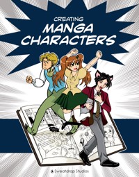
Manga is an emotive and expressive form of storytelling that has become popular worldwide; vivid and fascinating characters make a large contribution to its appeal. Characters are an essential component of a good story, crucial to the plot and vital for engaging the reader's interest and emotions. They are also enormous fun to imagine and to draw, but it is not always easy to fit your characters, your world and your plot together to create a seamless, convincing whole. Written and illustrated by five artists from Sweatdrop Studios, this book starts with drawing in the manga style before going on to describe the process of character creation and how your character could express their personality and emotions. Five original characters help to explain every topic, including character traits, from personalities and typical roles all the way down to the individual details important to make your character unique. The book also looks at the creation of side characters to complement your main character, and world-building. Packed with tips, it describes how to make your world realistic and intriguing, no matter how fantastical or everyday its basis.
Das E-Book können Sie in Legimi-Apps oder einer beliebigen App lesen, die das folgende Format unterstützen:
Seitenzahl: 176
Veröffentlichungsjahr: 2012
Ähnliche


Copyright
First published in 2012 by The Crowood Press Ltd, Ramsbury, Marlborough, Wiltshire, SN8 2HR
www.crowood.com
This e-book edition first published in 2012
© Sweatdrop Studios 2012
All rights reserved. This e-book is copyright material and must not be copied, reproduced, transferred, distributed, leased, licensed or publicly performed or used in any way except as specifically permitted in writing by the publishers, as allowed under the terms and conditions under which it was purchased or as strictly permitted by applicable copyright law. Any unauthorised distribution or use of this text may be a direct infringement of the author’s and publisher’s rights, and those responsible may be liable in law accordingly.
ISBN 978 1 84797 448 8
Art and text by Morag Lewis, Rebecca Burgess, Irina Richards, Chloe Citrine and Ruth Keattch. Photography by Sergei and Morag Lewis.
With thanks to Sonia Leong for advice and encouragement, and to Laura Jacques for assistance with proofreading.
CONTENTS
Title Page
Copyright
Introduction
1 Anatomy and Perspective
2 Creating Expression
3 Character Roles
4 Creating a Setting
5 Inventing the Character
6 Introducing Side Characters and Mascots
7 Character Breakdown
8 Telling the Story
Further Information
Index
INTRODUCTION
History of Manga
Modern manga as an art form began in the early part of the twentieth century, but its roots date back much earlier than that. In fact, the earliest pictures that appear to show narrative continuity are attributed to a Buddhist priest named Toba Sojo who lived in the eleventh century. His Animal Caricature scroll, or Choju Giga, is a beautiful example of brush lineart, and is thought to be a satire on the Buddhist clergy of the time. Between then and the present date Japan has a long history of illustrated stories, from the Otogizoshi (literally Companion Tales), which are a series of short illustrated stories produced in the fourteenth and fifteenth century, to Kusazoshi (woodblock printed illustrated stories which covered all age ranges) and Ukiyo-e (literally Pictures of the Floating World, mass-produced woodblock prints that usually featured landscapes or city scenes), both of which became popular during the Edo and early Meiji periods (1600–1900).
Despite that rich history of illustrated storytelling, the roots of manga before World War II are hard to define. The word itself can be translated as ‘whimsical pictures’, which comes from the Chinese characters used to write it in Japanese. It was used to describe Kusazoshi and Ukiyo-e, but the first person to use the word ‘manga’ in the context we know today was the artist Yasuji (Rakuten) Kitazawa (1876–1955). He was, in a way, the founder of manga – at least of the word and concept. After the term ‘manga’ became known, artists like Osamu Tezuka and Machiko Hasegawa were able to produce the artistic styles associated with manga that we all know and love. Tezuka took his initial inspiration from Disney, but developed it in his own way, which just goes to show that inspiration can come from anywhere, and telling stories in pictures really is a global phenomenon.
Nowadays, the words ‘manga’ and ‘anime’ and the corresponding graphic style are well known throughout the world. Manga is often referred to as ‘those Japanese comics’ and it is assumed that most – if not all – manga is full of wide-eyed ninjas, assassins and maids in frilly dresses. In fact, manga is so much more than that.
Corbyn the catboy.
Manga is a medium, and thus covers all genres and audiences, from school kids to housewives. Because it is black and white it is cheap to produce in bulk, which means page count is not such an issue in terms of cost (as opposed to the early Western comics, which opted for coloured pages and therefore tried to squeeze as much story onto each page as possible). This in turn means authors have the space to experiment with page and panel layout and the time to go into emotions and thoughts in a pictorial manner. Manga characters are extremely expressive, with high emphasis placed on facial features and gestures. Sometimes it is sufficient just to draw a character’s eye or hand to express their feelings and moods.
The art style itself is hard to define. It is true that many manga characters have big eyes and small mouths, but so does Betty Boop, and many manga characters have much more realistically proportioned faces. However, the emphasis on eyes is something that appears to be based on culture; research has shown that, when looking at pictures of faces, Western viewers tend to focus on the mouth while Japanese viewers focus on the eyes. You can even see this in the ‘emoticons’ used by each culture; Japanese emoticons put emphasis on the eyes (“^_^”) while American emoticons emphasize the mouth (“:)”). It has been suggested that this is because emotional control is valued in Japan, but the eyes are harder to control than the mouth, so Japanese people would concentrate on the eyes to gauge emotion. Whatever the reason, the eyes are a particularly expressive part of the manga style, and it is not surprising that they are the feature most picked out by casual viewers.
Nowadays, manga is no longer an exclusively Japanese art form. Many eastern countries have started and succeeded in producing their own versions of manga-style comics. Styles like manwha (Korean) and manhua (Chinese) have emerged. In the West, many creators have been inspired and influenced by the manga style, just as Tezuka once took inspiration from Disney.
Creating Characters
Although a visual medium, there is no doubt that story is an important factor to manga. And what makes a good story exactly? There are many factors that add up, but one vital factor is most certainly strong characters. Often a story will be of no interest to us if there isn’t a great character there to lead us through it.
In Japanese manga, a story’s focus on a character is particularly emphasized visually. The popular and distinctive styles we recognize today began with – among others – the artist who is called the ‘Godfather’ of manga due to his roaring success; Osamu Tezuka. Tezuka purposefully exaggerated the eyes and mouths of his characters so that they could become more likeable and charm readers into following them through a story.
Other areas of Japanese culture take character creation one step further, inventively using the look, personality and setting of a character to create entire franchises. It is not uncommon to find buildings or institutes in Japan that have cute mascots – indeed, Tokyo Tower and Mount Fuji both have cute alter egos! ‘Vocaloid’ is another great example of this. It is a rather technical computer programme, mainly aimed at professional musicians. But its invention of selling each different ‘voice’ as an adorable character with a distinct personality has led to a much more charming product. As a result, Vocaloid has reached out to a much wider audience and created everything a great character can offer; from fan-art communities to sell-out concerts.
Whether we find them enchanting, or love to hate them, characters are always what we relate to the most; they are what we remember in a story, manga, comic, video game or franchise. Whole websites are dedicated to single characters from media, wikis are formed to record as much information as possible about beloved characters – from blood types or birth dates to favourite foods and animals. While it is always possible to find similar characters, it is near impossible to find two characters completely alike in physical appearance or personality. Japan’s variety in characters is an inspiration to many manga fans, and we hope in this book we can help you create your own inspiring characters!
Tools and Equipment
Before you start creating your characters, let’s look at the materials you need to use. The stationery you choose doesn’t need to be very specialized or expensive. You don’t have to use exactly the same materials that other artists use or recommend – experiment with different brands to compare quality and find out which ones you are most comfortable with. You don’t have to use materials any exact way either; sometimes experimenting with techniques and equipment and using them in a way they weren’t intended can create some wonderful effects that will complement your artwork.
Workplace
If you are going to make a comic, you will be spending a lot of time at your workstation, so a comfortable, ergonomic set-up is crucial. Choose a place where you are not going to be disturbed. Make sure your chair is of a height so that your feet can rest comfortably on the floor (or a foot rest of some kind will do). Your arms should be able to rest on your table top with your elbows at a right angle. Wrist and arm strain are very difficult for artists to deal with, so it is important to do everything you can to avoid developing these problems in the first place.
It is always better to work with light coming from your ‘non-drawing’ side (for example light coming from the left if you are right-handed). Plenty of daylight is important, especially if you are working with natural media and colours, but make sure you also have a good bright light to use at night. Ensure that you have enough space to keep all your drawing materials at hand. Some artists will set aside some space for books as well if they are running low on inspiration. Keeping your favourite comics or art books close by can be helpful if you are finding it hard to get into the mood for drawing. Also, keeping some space aside for reference material, such as books on anatomy or colour, or your laptop if you want to look up a reference for a difficult pose can be very helpful. Keeping prior research for a comic or project to hand is also important. When drawing comics you can often forget little details on things such as costumes and settings, so it is important to keep things like character sheets and plans for rooms close to hand. You could keep these in a folder which can allow for more drawing space, or perhaps have a drawing desk set up against a wall, so that you can hang up all those important research images right in front of you. Some artists also like to create ‘inspiration boards’ when making comics. These are collections of images, colours and notes – anything that helps give you ideas and inspiration for your comic setting, story, artwork and characters. The images are then collaged up on a drawing desk wall, so that you can look to them for ideas, colour schemes or motivation when you are creating your project.
Stationery (left to right): brush pen, dip pen nibs, dip ink, dip pens, fineliners, ruler and set square, mechanical pencils. They are resting on smooth heavy cartridge paper. (Photo: Sergei Lewis)
Pencils
Keep a good supply of pencils. Mechanical pencils are good as they don’t need sharpening. If you intend to finish your image digitally, there is a technique using coloured pencils that can be very useful. If you pencil out images in coloured pencil, you can ink over the top without having to take the time to rub out the pencil marks underneath, then when you scan in the inked images, the coloured pencil can be removed leaving only the ink. In the past, ‘non-photo’ (or ‘non-print’) blue was used, a colour which can’t be picked up by the cameras used by professional designers.
Most scanners will pick up any colour you use, but you can either set the threshold high enough so that pale colours are missed, or you can digitally remove the colour. If you decide to use this technique, make sure you choose a coloured pencil that isn’t too dark in shade, as darker colours are harder to remove digitally. Also, test out different pencils before using, since some brands can be too waxy, meaning your ink will not show up very well on top of the pencilled art. Pencil and lead choice is a matter of personal preference; some artists like to work with very soft pencils which smudge easily but also rub out easily, while some prefer hard pencils which give a crisp, clear line but which cannot be fully rubbed out.
Erasers
A good-quality eraser is a must. Colourful funky-shaped erasers may be cute, but they won’t do the job properly! Make sure the eraser is suited to the type of paper you are using – for example, hard erasers can scrape the surface of rough paper and damage it, and can also damage ink lines. Putty rubbers work by ‘absorbing’ graphite rather than wearing it away, so last longer than normal rubbers. They are kneadable so can be shaped into forms good for delicate work. However, they can become sticky if too warm, and they aren’t good for erasing large areas. It is a good idea to keep your eraser separate from your other art materials, especially pencils. Erasers can get dirty very easily when kept with other drawing materials, particularly graphite pencils. This can result in black smudges and marks on your artwork when you’re using the eraser.
Choose the stationery that is comfortable for you to use.
Rulers
When drawing manga, it is useful to have a straight ruler (make sure it is long enough for the size of your paper – for example, a 30cm ruler is ideal for use with A4 paper) and a set square for drawing panels. Stencils of different shapes, such as ovals, can be a great help for drawing speech bubbles. If you are having trouble keeping your ruled lines parallel with your page, it can be very handy to get a cutting or measuring board to work on top of, because you can use the measures on the board to help keep everything aligned.
Fineliners
Most likely, you will need several fineliners of different thicknesses (for example, 0.3 for fine details and facial features, and 0.5 for inking larger areas). Quick-drying, waterproof fine liners are ideal. Avoid using biros, especially if you create artwork for print; they create scratchy lines, which can look beautiful in a sketch but do not reproduce well. You can also use a thick marker for filling in large black areas such as hair and clothing.
Wacom Intuos 3 graphics tablet. This is one example of many that are suitable for digital artwork. (Photo: Sergei Lewis)
Dip and Brush Pens
Dip and brush pens are a non-messy way to create more ‘flowing’ lines. Dip pens are like fountain pens in that they use flowing ink through a nib, but instead of having a replaceable cartridge, they are used with a bottle of ink (which they are dipped into, hence the name). Nibs are pliable and so can give good line width variation, although they have their limits. A variety of nibs can be useful for very broad lines and fine details. Bear in mind that nibs do wear out, so you will need to maintain a steady supply.
Brush pens are pens with brush tips. They are less messy than actual brushes and more flexible even than dip pens, although they can be hard to control on the finer lines. They can also be used for colouring.
Markers
Many artists colour their work using special marker pens. The two most common varieties are Copic and Letraset. These markers come with a variety of nibs, such as broad, fine or brush, and give an even, smooth colour with a light watercolour effect. You can layer the colours, or blend them together. There are a few drawbacks; most markers are alcohol-based, so if you use them to colour an image you will have to draw in pencil, or choose alcohol-proof ink or fineliners. Also, marker colours easily seep through thin paper, so heavier paper or special marker paper work best.
Screentones
Have you seen those ‘patterns’ on manga pages? They are called screentones and are used to accentuate and emphasize the narration. There is a great variety of screentones, from simple dots that can be used as shadows, to swirly, sparkly and feathery ornaments to indicate mood and atmosphere. Traditional screentones are cut into the required shape and pasted onto a manga page. However, many artists use digital screentones as they are much easier (and cheaper!). Digital screentones are available for commonly used art programs such as Photoshop, but many artists use screentone-specific programs such as Manga Studio, an affordable program with a lot of tone choice.
Digital Sketching And Inking
Graphic programs such as Photoshop and Manga Studio can be used to create and edit artwork. It is entirely up to you how much of your artwork you do on the computer, if any. Some artists draw all their art digitally from scratch. Others prefer to sketch and plan on paper, then do the correction, inking and finishing digitally. Some prefer to ink by hand, but tone on the computer, and so on. If you do any digital work at all, a graphics tablet is an essential tool to create professional-looking art. Graphics tablets are electronic tools consisting of a flat surface and a pen-like stylus. They usually connect to your computer via a USB port, and the computer picks up what the stylus does when touching the surface – in its simplest use, a graphics tablet is a mouse in the form of a pen. However, good-quality tablets are capable of pressure-sensitivity, and most art programs will detect this, which means you can use a graphics tablet like a dip pen, varying your line width with pressure.
Digital drawing can seem daunting at first, and it takes a bit of time to develop this new skill. However, once you have got used to it, digital drawing becomes second nature and you’ll be looking for the ‘undo’ button on your pencil!
Paper Options
The type of paper you use depends on the purpose of the art you create, your chosen medium, and the materials you are going to use. Ordinary A4 cartridge printer paper is good for producing sketches that are going to be finished digitally, or for black and white linearts or artwork using fineliners. However, if you are using dip pens, you may prefer heavy smooth cartridge paper or Bristol board; cheap printer paper tends to let ink ‘bleed’, spreading out a little from the line you have drawn. If you are colouring your artwork using alcohol-based markers, it is better to use marker paper (and alcohol-proof ink!). You can also buy pads of special manga paper, which is bleedproof and heavy enough for both colouring work and creating black and white manga pages.
Whatever your choice of materials, practice makes perfect.
CHAPTER 1
ANATOMY AND PERSPECTIVE
The human body obeys certain rules of proportion, which we know instinctively but often don’t think about. The manga style can be deceptive in that some rules are clearly broken (for example, eye size relative to head size), but in fact most are maintained even in the more exaggerated styles. Obviously the choice of which rules to stretch (and how far) is up to the individual, but knowing the rules first is essential to keep your characters looking convincing.
Here is a quick introduction to drawing in the manga style and the rules of proportion that will help keep your characters believable whatever you choose to do with them.
Breaking the rules of proportion can be very effective.
Head-to-body Ratios
If you are struggling with perspective, or have noticed that different manga styles seem to use different proportions, you have inadvertently stumbled upon the Head-to-Body ratio. Simply put, this ratio dictates how many ‘heads’ will fit into the height of the character (for example, a 1:8 ratio means that for one body, there will be eight head heights, including the head itself).
The smaller the ratio, the more deformed and chibi-like the character will be. However, do not assume that a higher ratio will make them look more defined and adult; as you can see with the 1:10 ratio, there is a limit to this approach.
Different manga genres vary the number of heads their characters have for effect. Shojo manga style is usually more realistic, and will use the larger ratios over the smaller. In certain shojo manga, figures are drawn very tall (especially the handsome, male love interests!); up to nine heads high. These tall, thin figures help give shojo manga its graceful and delicate look.
However, it’s necessary to know the rules before you break them
Examples of different head ratios: a boy who is six heads high, and a girl seven heads high.
In shonen manga the characters are often drawn younger, so they aren’t as many heads high, giving the characters a sturdier and more solid feel to them. A typical shonen