Erhalten Sie Zugang zu diesem und mehr als 300000 Büchern ab EUR 5,99 monatlich.
- Herausgeber: Creative Homeowner
- Kategorie: Lebensstil
- Sprache: Englisch
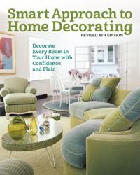
An all-new edition of the perennial favorite, Smart Approach to Home Decorating is an aspirational guide to introduce you to interior design. In updated text accompanied with over 400 gorgeous photos, this book explains everything a homeowner needs to know to design and decorate a house with professional results. Topics range from the basic principles of design, space planning, layout, and arrangement to choosing furniture, colors, patterns, and fabrics. This updated edition also features new information on current design trends and new materials. Design and decorate room by room like a professional!
Sie lesen das E-Book in den Legimi-Apps auf:
Seitenzahl: 383
Veröffentlichungsjahr: 2021
Das E-Book (TTS) können Sie hören im Abo „Legimi Premium” in Legimi-Apps auf:
Ähnliche


Copyright © 2007, 2020 Creative Homeowner
This book may not be reproduced, either in part or in its entirety, in any form, by any means, without written permission from the publisher, with the exception of brief excerpts for purposes of radio, television, or published review. All rights, including the right of translation, are reserved. Note: Be sure to familiarize yourself with manufacturer’s instructions for tools, equipment, and materials before beginning a project. Although all possible measures have been taken to ensure the accuracy of the material presented, neither the author nor the publisher is liable in case of misinterpretation of directions, misapplication, or typographical error.
Creative Homeowner® is a registered trademark of New Design Originals Corporation.
Smart Approach to Home Decorating, Revised 4th Edition
Editor: Colleen Dorsey
Designer: Wendy Reynolds
Technical Editor: David Schiff
Indexer: Elizabeth Walker
Print ISBN 978-1-58011-845-3eISBN 978-1-60765-743-9
Library of Congress Control Number:2019946871
We are always looking for talented authors. To submit an idea, please send a brief inquiry to [email protected].
Creative Homeowner®, www.creativehomeowner.com, is an imprint of New Design Originals Corporation and distributed exclusively in North America by Fox Chapel Publishing Company, Inc., 800-457-9112, 903 Square Street, Mount Joy, PA 17552, and in the United Kingdom by Grantham Book Service, Trent Road, Grantham, Lincolnshire, NG31 7XQ.
Acknowledgments
For the wealth of information and guidance they have provided, thank you to the American Society of Interior Designers (ASID), the International Society of Interior Designers (ISID), the International Furnishings and Design Association (IFDA), the National Kitchen & Bath Association (NKBA), the National Association of the Remodeling Industry (NARI), and the Color Association of the United States.
Contents
Introduction
CHAPTER ONE
Design Basics
■Understanding Your Space■Creating a Plan■Decorating Room by Room■Design Workbook
CHAPTER TWO
Color and Pattern
■Creating Excitement■Introducing Pattern■Texture■Your Color Scheme■Design Workbook
CHAPTER THREE
The Right Light
■Natural Light■Types of Artificial Light■Selecting Light Levels■Types of Bulbs■Determining Lighting Needs■Light Fixtures■The Role of Lighting in Architecture■Design Workbook
CHAPTER FOUR
Style Underfoot
■Wood Flooring■Laminate Flooring■Resilient Vinyl Flooring■Ceramic Designs■Natural Stone■Carpeting and Rugs■Design Workbook
CHAPTER FIVE
Walls and Windows
■The Way with Walls■Decorative Paint Techniques■Painting Walls and Trim■Selecting Wallcoverings and Borders■Window Treatments■Design Workbook
CHAPTER SIX
Distinctive Touches
■Elements of Design■Special Details■Design Workbook
CHAPTER SEVEN
Furniture Facts
■Types of Home Furniture■Making Choices■Furniture Styles■Judging Quality■Recycling Your Furniture■Design Workbook
CHAPTER EIGHT
Room by Room
■Foyer and Hallway■Living Room■Family Room■Dining Room■Kitchen■Bedrooms■Children’s Rooms■Bathroom■Working with Professionals■Design Workbook
CHAPTER NINE
Kitchen Design
■Set Priorities■Basic Kitchen Layouts■Choosing Cabinets■Countertop Options■Selecting Fixtures■Design Workbook
CHAPTER TEN
Bathroom Design
■Set Priorities■Basic Layouts■Types of Bathrooms■Shopping for Bath Products■Fixtures■Storage■Serviceable Surfaces■What’s Your Style?■Design Workbook
CHAPTER ELEVEN
Outdoor Living Areas
■Decorating Sunrooms and Porches■Patios, Decks, and Gazebos■Landscaping Tips■Design Workbook
Appendix
Resource Guide
Glossary of Home Decorating
Photo Credits
Introduction
Most people don’t realize it, but there is an interior designer in them waiting to get out. The problem is that many people are afraid to take the steps that will give their creative persona its freedom. How often have you looked at a magazine or visited the home that was designed by a professional or decorated by someone who seems to have a flair for it, and been intimidated—convinced you could never get those kinds of results on your own? What those folks have that you may not is a knowledge of the basics of design. They know how to manipulate the architecture of a room and then go about adding colors, textures, patterns, lighting, and furniture to make the space truly unique. In this book, you will learn those basics and more.
Because so much of what you do (or hesitate to do) to your home is a matter of confidence, this book explains everything you need to know to make educated decisions about decorating projects. It starts with an easy explanation of space—how to analyze it and work with what you have. Simple instructions for creating your own floor plan, along with furniture templates at the back of the book, let you try out different layouts. A chapter on color, pattern, and texture gives you the inside information you will need to design flawless schemes with paint and fabric. And you’ll learn how to select the perfect wall, window, and floor treatments to pull together one cohesive look. If you’re debating about whether to buy new furniture or reuse existing pieces, you’ll find the answer in the chapter on furniture. Besides describing furniture styles, it offers important advice for judging quality in a piece and when it pays to refinish rather than buy new items.
Smart Approach to Home Decorating also addresses the special concerns of kitchen and bath design. So that you can make these rooms efficient and handsome, you’ll find space-planning guidelines from the National Kitchen & Bath Association, as well as a rundown on the latest in cabinetry, fixtures, fittings, and finishing materials. You may also have questions about decorating as it pertains to specific rooms of the house. The chapter on decorating room by room comes with tips from professional interior designers who offer their advice about foyers, living rooms, family rooms, dining rooms, bedrooms, kitchens, and baths—and how to make each one special. And because today’s living extends beyond the front and back doors, this book takes you outside with ideas for giving outdoor living spaces, such as patios, decks, and porches, the same consideration as indoor rooms. To help you with the overall process, Smart Steps in every chapter take you through each phase of the decorating process. There is also a portfolio of inspirational designs in each chapter.
As the renowned celebrity decorator Billy Baldwin once said, “The first rule of decorating is that you can break almost all the rules.” Smart Approach to Home Decorating shows you how to make up your own rules with style and flair.
CHAPTER 1
Design Basics
UNDERSTANDING YOUR SPACE | CREATING A PLAN | DECORATING ROOM BY ROOM | DESIGN WORKBOOK
The strong geometric lines of this modern home’s architecture work along with industrial details to help shape the interior design.
Professional designers always begin a project by first analyzing the space with which they will be working. Things they look at include the size, shape, and intended use of the room. They also pay careful attention to any architectural features, such as molding, windows, and fireplaces, before considering colors, fabrics, and furniture. This chapter will help you think like a professional designer. You will learn about the conceptual nature of space and how to examine your own.
You’ll also learn how to manipulate space to make it more functional and what tricks designers use to fool the eye when they are faced with decorating oddly shaped or ill-proportioned rooms. Finally, understanding the basic concepts of design, such as scale and proportion, will sharpen your eye and help you create pleasing interiors. Later in this chapter you’ll learn how to take accurate measurements as well as how to sketch your ideas on paper just as professional interior designers do. Furniture templates, which you can find in the Appendix, will help you try out different ways to arrange your floor plan. But your first challenge as your own designer will be to become familiar with the basics of design.
Understanding Your Space
Most of the time homeowners decorate by intuition, and practice makes perfect—sometimes. There are no strict rules to follow; however, every serious student of design begins by learning several fundamental principles relating to space that are always useful when applied practically. These principles include scale, proportion, line, balance, harmony, and rhythm.
Scale and Proportion
Scale and proportion work hand in hand. In decorating, scale simply refers to the size of something as it relates to the size of everything else, including people and the space itself. Proportion refers to the relationship of parts or objects to one another based on size—the size of the window is in proportion to the size of the room, for example. Good scale is achieved when all of the parts are proportionately correct relative to each other, as well as to the whole.
To soften the sometimes severe look of modern design, a designer has countered by introducing round shapes in some furnishings.
Although it is easy to see that something is too large or too small for its place, it takes a deliberate effort to achieve good proportion. Usually, it requires patience and experimentation with various objects and arrangements until something finally looks right, so just keep at it.
Line
Next to consider is line. Simply put, line defines space. Two-dimensional space consists of flat surfaces, such as walls, floors, and ceilings, which are formed by intersecting lines. Adding depth, or volume, to a flat surface creates three-dimensional space such as a room. However, lines do more than define physical space; they also suggest various qualities. For example:
■Vertical lines imply strength, dignity, and formality. A good example is a classical column, which always appears stately and strong.
■Horizontal lines, on the other hand, convey relaxation and security, such as a restful bed or a sturdy platform.
■Diagonal lines, such as a balustrade or a gable, express motion, transition, and change.
■Curved lines, like those of a winding path, denote freedom, softness, and sensuality.
As you start to select the furnishings to include in your room’s design, look for ways to incorporate a variety of lines into the plan. Most modern rooms are rectilinear. To relieve the repetition of the squares and rectangles inherent in the architecture and make them more interesting, introduce a few curves or diagonals with furniture and accessories.
Balance
Balance is another important concept related to space. It refers to the equilibrium among forms in a room. All of the furnishings, large and small, should be distributed evenly throughout the space, not just to one side of the room, for example. With balance, relationships between objects seem natural and comfortable to the eye. For instance, two framed pictures of relatively equal size and weight look appropriate hanging side by side on a wall, whereas the pairing of two pictures of unequal size and weight seems awkward and out of balance. Balanced relationships between objects can be either symmetrical or asymmetrical.
The asymmetrical assemblage of objects on a credenza, above, suggests an informal, contemporary sensibility. In a different home with more traditional leanings, an architect designed an oculus for the wall above a bank of windows in a breakfast room, above right. This feature, with classical roots, gracefully balances with the pitch of the ceiling. Finally, the staircase, right, epitomizes the sense of movement suggested by diagonal lines.
A curvaceous sofa, upholstered in pale shades of leaf green and aqua blue, and a funky S-shape coffee table exude a fresh, free-spirited essence with refined retro appeal.
■Symmetry. This refers to the same arrangement of parts, objects, or forms on both sides of an imagined or real center line. A good example of symmetry is the placement of a chair and sconce on each side of a fireplace. For the arrangement to be pleasing, however, the chairs must be of equal size, as must the sconces, and placement must be identical. Anything that is even slightly off will be distracting. Because symmetrical arrangements appear formal, they look appropriate in a traditional setting.
■Asymmetry. This refers to the balance between objects of different sizes as the result of placement. For example, picture a grouping of tall, slender candlesticks on one side of a mantelpiece and a short, wide vase on the other. As long as the scale is correct, asymmetry can be every bit as pleasing as symmetry. Because asymmetrical arrangements are informal, they have contemporary sensibility, but they can also offset a too rigidly formal look.
Harmony and Rhythm
Two other concepts, harmony and rhythm, concern creating patterns in space. Harmony is achieved in design when all of the elements relate to one another. In other words, everything coordinates within one scheme or motif. Matching styles, colors, and patterns are good examples. Rhythm refers to repeated patterns. You’ll read more about these two concepts in Chapter 2, “Color and Pattern,” here. For now, keep in mind that harmony pulls a room together, while rhythm keeps interest going around to different areas of a room. The key to creating good harmony and rhythm is balance; always add at least one contrasting element to liven up things.
Viewed from the dining room, you can see the deeply curved back of the sofa. Its curved shape allows easy movement around the room. The round rug reinforces the relaxed mood.
Creating a Plan
Chances are there are some things you like about your existing space, as well as things you don’t like. On the plus side, the windows may overlook a beautiful view, or the sunlight may stream into the room at the perfect hour of the day. However, there may be too many doorways and not enough solid walls for placing furniture, or the fireplace or some other large built-in feature, such as a bookcase, may be awkwardly situated. Maybe the room is too small for comfortable entertaining or too large to feel homey. Sometimes the space is oddly shaped; it may be long and narrow, for instance, or the ceilings may seem too high or too low. Unless structural changes are an option, you’ll have to work with the space you have rather than against it. In many cases, the negatives are not so much the structural aspects of the space but the scale of the objects chosen to fill it and how they have been arranged. Follow these Smart Steps to design a functional as well as aesthetically pleasing space.
smart steps where to begin
Step 1 CREATE A NOTEBOOK
Use a loose-leaf binder to keep notes and any other information relating to your project, including your analysis of the existing space and your ideas and goals for it. Later on you can use it to hold paint chips, fabric and wallpaper samples, and pictures from magazines of rooms and furniture styles to which you may want to refer during this or a future decorating project. Begin by listing what you think are the best and worst features of the space. Call attention to important aspects, such as the orientation of the windows at various times of the day. Depending on when you typically use the space, you’ll need to know whether it gets sunny in the morning (east-facing windows), at midday (south-facing windows), or in the late afternoon (west-facing windows). Alternatively, the space may get very little natural light (north-facing windows). If you routinely take a nap in the family room before dinner, think twice about positioning the sofa across from windows with a western exposure, for example. Also, take note of the view. Big, beautiful windows lose much of their allure when there isn’t something pleasant outdoors to admire.
Next, look at the layout in terms of permanent features, such as doors and doorways, windows, stairs, and closets. Are there too few? Too many? Does the location of any of them interfere with the layout? Are any shapes awkward? Consider adjacent spaces, too. Do they present problems concerning noise or privacy?
Jot down all of the different activities you expect the space to accommodate, along with any additional storage you may require.
Even if your budget is limited, make a list of all the possible solutions to your space problems. These might include enlarging the layout by building on or incorporating adjacent existing space, or adding, eliminating, or moving a wall, doorway, or window. Of course, structural changes such as these can be costly and complicated and will require consultation with an architect or qualified remodeler. But the time for considering the possibility of making any one of them is during the early planning phases of your project, not after you’ve ordered new furniture based on the old layout.
Positioning a bed so that it doesn’t face a window may be necessary if you want to sleep in most mornings. If that’s not possible, you can address the problem with light-blocking shades or curtain panels.
When you’re planning a dining area—especially in tight spaces—it’s important to think about clearances for comfortable seating, getting up from chairs, and passing and serving hot foods around the table.
Step 2 WALK THE SPACE
Go into the room, walk around it, spend time in it. It’s a good idea to carry a clipboard and paper so that you can record information to add to your notebook later. Is there an easy flow from one area to another, or are the aisles tight or cluttered? Observe the traffic pattern from all entrances into the room. Notice the direction in which the doors swing. Is the furniture arrangement comfortable and attractive? Is there a focal point—one substantial element, such as a fireplace or a large piece of furniture—that anchors the space? If the space is large, there should be more than one focal point. Are activity areas clearly defined, or do they spill into one another? What’s your overall impression? Does the room feel cozy or cramped? Airy or cavernous? Are the furnishings the right size? Remember, with space, everything is relative. The living room may not be too small; the sofa may be too big for the living room, for example. Sometimes it’s the arrangement of furnishings that creates a problem. Pushing seating up against the walls isn’t always the best placement. It’s better to create small conversational groupings at opposite sides of a room if the space is large, or place one grouping in the center of a small space. Make sure you can move around these areas; traffic should never interrupt them. In later chapters, you’ll learn how color, pattern, and light also affect your perception of space.
Step 3 MEASURE UP
Invest in a good-quality 25-foot (8m) retractable steel measuring tape. Use it to accurately measure each wall from corner to corner.
After obtaining the overall dimensions of the room, measure the size and location of all the openings (doors and windows) and any other fixed features, such as a fireplace, staircase, closets, built-in bookcases, and cabinetry.
An informal sketch of the room you are decorating will help you to get a quick idea of what you can do with the space.
Refine your plans with a formal drawing, which should provide an accurate scaled representation of the room’s features and furniture.
While you’re at it, measure the existing furniture, too—even those pieces you may be thinking of replacing. With a few adjustments to the layout, you may decide to retain some of them. You can refer to these measurements when you’re ready to add furniture pieces to your plan.
Another reason to measure all of the furniture pieces at this point is so that you can compare their heights with those of the fixed features in the room. Keep in mind that when you draw your sketch and floor plan later, they will reflect only the footprint of these objects. For visual interest, you’ll want a pleasing balance of tall and short elements in the final design.
Step 4 MAKE AN INFORMAL SKETCH
As you walk through the space, make a freehand drawing. Note all dimensions on the plan or in the margin, including the height of the ceiling. (See Figure 1.) Pencil in electrical switches and outlets, cable input, phone jacks, radiators, heat registers, air ducts, and light fixtures as well. Indicate adjoining rooms or areas on the sketch, too. You don’t want to block access to any of them.
Step 5 DRAW PLANS
Once you evaluate the existing space thoroughly, get ready to draw the layout to scale on ¼-inch (or 1cm) graph paper. Each square will represent one foot (or 10cm). For example, if a wall measures 15 feet, the line you draw to indicate that wall will use 15 squares (in metric, if a wall measures 4.5m, the line will use 45 squares). To make straight lines and accurate corners, use a T-square; for the arch that symbolizes an open door, use a compass. If you don’t have these tools on hand, be as careful as possible, and use any straight-edged instrument to draw your lines. You might invest in a handy ruler.
On your drawing, indicate the measurements the same way a designer does: for 3 feet and 2 inches write 3'-2"; for 14 feet and 3¼ inches write 14'-3¼" (if working in metric, simply use decimals: for example, 4.4m). Figure 3, shows the symbols to use for the room’s major features. When your drawing is complete, you’ll have a good idea about how much and what size furniture will fit into the space.
Step 6 CREATE FURNITURE TEMPLATES
Next, make cutout templates of the furniture, using the same ¼-inch (1cm) scale. Although you can refer to so-called standard sizes for furniture, be aware that there are variations. One manufacturer may make a 96-inch (244cm) sofa, while another makes one that is 96½ inches (245cm). It’s okay to estimate for your rough sketch, but you should be precise on your final drawing. Although a ½ inch (1.3cm) here or there won’t make any significant difference to your layout, it’s best to use accurate measurements. For new furniture, refer to the manufacturer’s spec sheet, which will include dimensions. Don’t ever buy a piece of furniture you think looks like the right size. After paying for it and waiting weeks for its delivery, you don’t want to find out your guess was wrong. If it’s a custom order, you’re stuck with it. Even with furniture you already own, don’t assume standard size; measure it.
If you want to be thorough, include the correct symbols on your plans. Figure 3 shows you how to indicate doors and windows, electrical fixtures, and registers for heat and air.
In tight corners, it is important to get the most accurate measurements for furniture.
Use the standard furniture symbols in the Appendix to draw your templates. We’ve drawn each one to scale based on average dimensions, but you’ll have to adjust the scale to your furniture’s true size.
Cutouts to include in your template kit could be sofa beds, tables, chairs, freestanding bookcases, cupboards, armoires, chests of drawers, and so on. If you are designing for the kitchen or bath, refer to those chapters and to the templates in the Appendix. Just remember that the appliances and fixtures in these two rooms cannot be moved as easily as pieces of furniture. There are technical considerations with regard to plumbing, electricity, and zoning regulations that affect placement. You may want to put your ideas on paper, but consult a kitchen or bath specialist or a licensed contractor before making actual changes.
Decorating Room by Room
With scaled templates in hand, you can move things around your scaled layout to see how to group pieces into different arrangements. Always note the traffic pattern in your floor plan when arranging furniture, however, and start by placing the largest, most important pieces first. For major aisles that will be used to move in and through the space, allow at least 3 feet (1m) if at all possible. Sometimes you can use furniture as a sort of boundary that prevents traffic through a work or conversation area—seating that is arranged around two or three sides of an area, for example. However, never place furniture in the middle of a major traffic lane.
If the shape of the space bothers you—it’s too long, too narrow, too wide, too low, too tall—there are several simple tricks you can play on the eye to camouflage the problem visually. For example, if the room is:
■Long, divide the space by creating two separate, major groupings of furniture. Use area rugs to anchor each group in the divided space. You can also use square shapes, such as a square area rug, to “widen” the space.
A tight grouping of furniture in a large living room feels cozy and keeps traffic out of the conversation area.
Tall bedposts illustrate how vertical lines can allude to height in a master bedroom situated under a pitched roof.
In a living room—whatever the style—a balance of personal touches and company comforts always strikes a pleasing note.
■Narrow, arrange furniture on the diagonal. In the bedroom, for example, place the bed catty-cornered. In the living room, angle the sofa between two walls. Again, introduce more squares, such as a square coffee table.
■Low, add height with tall furnishings, such as bookcases, which will make the space feel grand. You might also consider tall lamps, such as torchères, or window treatments that extend above the window frame and hang from the area just below the ceiling to the floor. Use as many vertical lines in the room as possible, even on wall and fabric treatments. Vertical-stripe wallpaper or curtains are good examples. (See Chapter 2, “Color and Pattern,” here.)
■Tall, lower the scale of the space by incorporating more horizontal lines in the room. Install molding one-half or three-quarters of the way up the walls to visually shorten them. Hang pictures lower on the wall. (See Chapter 6, “Distinctive Touches,” here.)
smart tip CLEARING OUT
If you are having trouble creating a pleasing arrangement of furniture in a room, it can help to remove all of the contents and start from scratch. This is a good idea if you have trouble picturing things on paper or if you aren’t going to buy a lot of new furniture and just need a fresh start. If at all possible, strip the room down completely, removing all of the furnishings, including window treatments, rugs, wall art, and accessories. This way you can observe the true architectural nature of the space without distractions that influence your perceptions. For example, minus the trappings of curtains, you can see that two windows may be slightly different sizes or installed too close to a corner. Other things you may notice might be odd corners, uneven walls, radiators or heating registers that are conspicuously located, or any other quirky features that are unique to your home. Don’t be in a rush to start filling up the room again.
Live with it empty for a few days so that you can really get a sense of the space. Then slowly begin to bring things back inside, starting with the largest objects. You’ll know immediately when you’ve crossed the line with something that doesn’t belong. But you have to be willing to pull back and pare down.
Focal Points
There has to be one dramatic element in a room that draws your immediate attention. This is the focal point. If you are lucky, it may be a distinctive architectural element, such as a fireplace, a built-in cabinet, a staircase or entry door in a foyer, or a spectacular window. If the room does not have one, create a focal point with furnishings. This could be a beautifully dressed bed; a large central seating group; dramatic window treatments on an otherwise undistinguished window; a massive table, armoire, or cabinet; or wall art, particularly if it is highlighted. (For more information, see Chapter 3, “The Right Light,” here.) The focal point should be one of the first elements penciled onto your plan.
In this studio apartment, a monochromatic neutral palette precludes any sense of clutter. A fireplace anchors the sitting area and serves as a focal point in the space.
Multipurpose Space
No matter how much space we have, most of us complain about needing more. One way to get it is to use a room or an area for more than one purpose. For example, the kitchen may also serve as a home office or family room; a hallway is another spot that can double as an office; even a living room can serve more than one function, whether that of a part-time dining room, guest room, or study. Seemingly impossible spaces can be adjusted to accommodate more than one function as well. Furniture that folds up when not in use is helpful. One excellent example is a drop-leaf dining table that can be stored unobtrusively against a wall in the living room, then opened up when necessary. If you entertain overnight guests occasionally but not often enough to reserve a special room for the purpose, buy a convertible sofa. Keep extra linens in an antique trunk that can also act as a coffee table, or purchase a large ottoman with a hinged top that opens up to roomy storage. In a dining room/office, use a folding screen to hide electronic office equipment when not in use, and house stationery and other supplies in the bottom half of the china cabinet. Another option, when the home office is shared space with another room in the house, is to purchase a computer armoire. You can also divide space with furniture. Remember: there is no rule that says all of it has to be arranged against a wall. Use tables or upholstered pieces to delineate separate functional areas of a room. Painting one wall a different color to visually separate one area from the other is another means of dividing space. If the front door opens directly into the living room, situate an open-shelving unit perpendicular to the door to create an entry area. If you’ve always wanted a quiet little getaway in your home but don’t have the extra room, use a landing or the end of a hallway. A comfortable chair, a small table, and a lamp are all you need for a little peace and quiet with a good book or a music player and headphones. What about a corner in the bedroom? Use your imagination and try out other ways to make the most out of every square inch of space in your home.
A small desk fits snugly in a corner. Like the other furnishings, it is painted a pale neutral color.
A full bed has been situated at an angle to take up the least amount of wall space, leaving room for a chest of drawers that faces the fireplace on the opposite side of the room.
Make use of vertical space. These built-in beds are nothing more than sturdy platforms and twin-size mattresses stacked in a corner and personalized with color.
As much as you may want to enlarge the functional capabilities of space by dividing it up into separate zones, don’t overdo it with a series of stuffy little warrens, either. To keep the overall appearance of the space free-flowing and balanced, you’ll have to provide at least one visual link that moves the eye along. There are a few different ways to do this. One is to use the same palette throughout. You may want to vary the intensity of the color from area to area, but sticking to the same basic hue creates a cohesive backdrop for everything. Another option is to “stretch” space by using the same floor treatment so that there is no separation as you move from one area to another.
Furniture Placement by Room
There are recommended guidelines for clearances you should follow when arranging furniture. Just remember, they are not strict rules. You might try using them as starting points or to analyze an existing space. Then rework some things to suit your taste and lifestyle. The important thing is to make the room comfortable for the people who use it.
■Living Rooms and Family Rooms. The kitchen may be the heart of a home, but the living room is where people can put their best foot forward. It’s also the place, along with the family room, where many of us relax in front of the TV, listen to music, read, or just hang out. It’s important, therefore, to have an attractive, comfortable arrangement of furniture in the living room, whether you use it only on occasion or every day.
If you entertain often, rate the existing room’s ability to accommodate large as well as small groups. Professionals recommend a distance of 4 to 10 feet (1–3m) between the sofa and chairs. Anything less is too cramped; anything more discourages easy conversation. For a comfortable amount of legroom, the coffee table should be positioned between 14 and 18 inches (36–46cm) from the sofa.
When there’s a large party, make sure there is space for guests to move around or break up into small groups. Most designers suggest one major seating area created by grouped upholstered pieces, plus several lightweight portable chairs located around the room. When company comes, these chairs can be moved around for socializing. Folding chairs are an inexpensive—and easily stored—option for entertaining, with a variety of styles and slipcovers available to suit your room.
A variety of comfortable seating options and useful surfaces makes a functional living room, even when it’s small.
Do you watch TV in the room? If so, grab your measuring tape again. The distance between a high definition television and and the seating should be just a bit more than the size of the screen. For example, to comfortably watch a 55-inch (140cm) television, you want to be about 7 feet (2.3m) away from it. Distances can be a bit shorter for 4k televisions with super high definition.
Is there a focal point? All of the furnishings should take their cue from that important feature in terms of scale, proportion, and balance.
If you use the living room as a part-time home office, guest room, or dining area, look at how your existing arrangement is working now. Is the space organized in a way that keeps each function from interfering with another? Ideally, there should be a traffic lane that is at least 3 feet (1m) wide to move from one zone to another. If you don’t have that much room, look for other ways to contain things. Your plan may have to include an armoire or chest that can keep items such as extra pillows and blankets, office supplies, or files tucked away until you need them.
■Dining Rooms and Kitchen Eat-in Areas. Certainly the table is the focus of any dining space, which could be a large, formal room, a niche in the kitchen, or even a spot in the corner of the living room. When analyzing your existing dining space, your first question should be, “Is seating around the table comfortable?” Good space planning calls for suitable room to get up, down, and around easily. A seated adult occupies a depth of about 20 inches (51cm), but needs 12 to 16 inches (30–40cm) more to pull back the chair and rise. Placing chairs at angles to the wall can save a few inches, but you’ll need either a round or square table for this strategy. Rectangular tables require 24 inches (61cm) per person and 32 to 36 inches (81–91cm) of clearance between the table and the wall. On the serving side, the table-to-wall distance should be at least 44 inches (111cm).
A generously proportioned coffee table is great for entertaining. Its round shape is easy to walk around even when the room is crowded.
A family room can be informal and attractive. A built-in cabinet handsomely hides entertainment equipment when it is not in use.
Need a reader’s corner or a spot for knitting? Position a comfortable chair out of the way, then add task lighting, soft cushions, and a throw for a catnap.
■Bedrooms. It may be your adult retreat, where you get away from the kids, or it may be your teenager’s domain, where adults are off limits; nevertheless, the bedroom is primarily the place one sleeps, so it’s only logical to begin designing this space by placing the bed. For your comfort, as well as for safety, there are minimum clearances recommended for the space around the bed. When two people share the room, there must be an aisle that is spacious enough for either party to get in and out of bed easily and without bumping into an open door or having to climb over another person.
Begin by measuring the floor space on each side of the bed. The minimum clearance between the edge of the bed and the wall should be 24 inches (61cm). In addition, allow at least 36 inches (91cm) between the edge of the bed and any door that opens into the room. If you place two beds side by side, maintain at least 18 inches (46cm) between them. This will accommodate a small night table and a pathway for the average adult to swing out of bed and walk between the beds comfortably.
Now that you understand how to analyze and design comfortable, safe, attractive space, you’re ready for the next chapter, which will teach you how to use a designer’s most powerful decorating tool: color.
A bunk bed is a great way to optimize space when you don’t have a lot to spare.
Make sure that there is sufficient clearance on either side of a bed for both people using it to get into and out of it.
design workbook RELAXED ELEGANCE
high drama
A vaulted ceiling creates theatrical excitement in this converted outbuilding. Understated but elegant furnishings refine the rustic charm of the space.
counterpoise
Single French doors positioned on either side of the fireplace, a focal point, provide access to and views of the garden from the building’s formal sitting area.
light focus
In the kitchen just behind the dining table, top left, a chandelier has been centered above the island, stylishly anchoring the food preparation area.
architectural detail
Pretty scrollwork dresses up an iron gate-inspired entry door, left. Like all rounded or curved lines, the curlicues soften the appearance of the heavy metal frame.
design workbook VERSATILE ARRANGEMENT
with the flow
This Southern California family room opens to an adjacent outdoor living area, so there must be an easy flow between the two spaces.
in the mix
Furniture that can be moved between the two spaces suits the family’s lifestyle. Groupings cater to various activities. (See also top left.)
calls for attention
The fireplace, far left, angled and to the side of the wall-mounted TV, is a focal point in the large room. Artwork above the mantel draws attention.
pattern & rhythm
A few exuberant prints, such as the chairs’ upholstery fabric, keep the eye moving around the large, otherwise neutral-toned space.
CHAPTER 2
Color and Pattern
CREATING EXCITEMENT | INTRODUCING PATTERN | TEXTURE | YOUR COLOR SCHEME | DESIGN WORKBOOK
Cool, playful colors, subtly repeated throughout this large, modern space, tie together three distinct areas while adding a retro feel overall.
The color palette you choose will set the tone for your home décor. If you are a traditionalist decorating a formal living room, you may find yourself drawn to a subdued scheme. A kid’s play room, on the other hand, may call for something lively. Of course, the size of a room and its light levels will also play a part in your choices. They not only affect color schemes but may also influence your decisions regarding pattern and adding bits of texture to a room. Working with color, pattern enlivens an interior with movement, creating a measured flow between the elements in a room. It can also establish a theme or a particular decorative period. A third element, texture, is like a visual break, a pause that prevents a scheme from becoming boring. It, too, can suggest mood—rustic, luxurious, or sleek, for example. Here’s how to competently use all three.
Creating Excitement
Color is the most versatile tool a designer can employ. It is both the easiest way to improve space and an effective way to alter it. It is the most exciting decorating element. Yet many of us find the power of color intimidating, and, fearful of stepping into new territory, we stick with neutrals. The palette for walls is often white or cream—colors that work fine as a backdrop for more richly hued furnishings but are less successful in rooms with neutral-colored pieces. Aside from the strength of color itself, the enormity of color choices available in paints, wallpapers, fabrics, and flooring options can also overwhelm us, making us retreat to the safety of white for the walls and neutrals throughout. So how do you break the monotony and establish an exciting color scheme? First you’ll have to overcome your fear of color, then narrow your choices. An explanation of the color wheel is a good place to begin.
How Color Works
Light reflected through a prism creates a rainbow, known as the color spectrum. Each band of color blends into the next, from red to violet. The longest band is red, then orange, yellow, green, blue, and violet. Modern color theory takes those bands from the spectrum and forms them into a circle, called the color wheel, to show the relationship of each color to one another.
The color wheel includes primary colors (red, blue, and yellow), secondary colors (green, orange, violet), and tertiary colors (red-blue, blue-red, and so on). Secondary colors are made by mixing two primaries together, such as blue and yellow to make green. A primary color, such as blue, and a secondary color, such as green, can be mixed to make a tertiary color—in this case, turquoise.
Paint is an inexpensive and easy way to introduce color to your home. If you are unsure, begin by accenting with color, as one homeowner did with painted chairs.
■Intensity and Value. Colors, or hues, may vary in their intensity—that is, the level of the color’s purity or saturation. The primaries, secondaries, and tertiaries represent colors at their full intensity. There are several ways to lessen a color’s intensity. You can lighten it with white to form a tint, darken it with black to create a shade, or add gray to arrive at a tone. In addition to changing the intensity of a color, these methods affect what is known as the color’s value. Value is the lightness or darkness of the color. Tinting gives a color a lighter value, and shading, of course, makes it a darker value.
COLOR WHEEL COMBINATIONS
The color wheel is the designer’s most useful tool for pairing colors. Basically, it presents the spectrum of pigment hues as a circle. The primary colors (yellow, blue, and red) are combined in the remaining hues (orange, green, and purple). The following are the most-often used configurations for creating color schemes.
Basic Color Wheel
Analogous
Complements
Split Complements
Triad
Tetrad
Putting the Color Wheel to Work
Now that you’ve got it in front of you, use the color wheel to help you envision certain color combinations. An analogous scheme involves neighboring colors that share an underlying hue.
Complementary colors lie opposite each other on the color wheel and often work well together. What, you ask? A red and green living room? Well, yes, in full intensity that might be hard to stomach, but consider a rosy pink room with sage green accents. The same complements in varying intensities can make attractive, soothing combinations. A double complementary color scheme involves an additional set of opposites, such as green-blue and red-orange.
Alternatively, you could go with a monochromatic scheme, which involves using one color in a variety of intensities. That way your room’s color scheme is sure to be harmonious. When developing a monochromatic scheme, lean toward several tints or several shades, but avoid too many contrasting values—that is, combinations of tints and shades. This can make your scheme look uneven.
If you want a more complex palette of three or more colors, look at the triads formed by three equidistant colors, such as red/yellow/blue or green/purple/orange. A split complement is composed of three colors—one primary or intermediate and two colors on either side of its opposite. For example, instead of teaming purple with yellow, shift the mix to purple with orange-yellow and yellow-green. Lastly, four colors equally spaced around the wheel, such as yellow/green/purple/red, form a tetrad. If such combinations sound a bit like Technicolor, remember that colors intended for interiors are rarely undiluted. Thus yellow might be cream; blue-purple, a dark eggplant; and orange-red, a muted terra-cotta or whisper-pale peach. With less jargon, the color combinations fall into these two basic camps:
■harmonious, or analogous, schemes, derived from nearby colors on the wheel—less than halfway around; and
■contrasting, or complementary, schemes, involving directly opposite slices of the pie.