Erhalten Sie Zugang zu diesem und mehr als 300000 Büchern ab EUR 5,99 monatlich.
- Herausgeber: CompanionHouse Books
- Kategorie: Geisteswissenschaft
- Sprache: Englisch
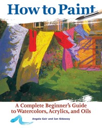
Start Painting Today! Covering the three most popular types of painting: watercolors, acrylics and oils, this comprehensive step-by-step guide provides basic information on materials and techniques as well as an exciting series of demonstrations aimed at complete beginners. The unique approach of this book is so simple that the reader can start immediately on original and exciting projects. Each section has practical information on materials and equipment and includes a gallery of work by various artists to inspire the beginner. The projects cover all types of subjects, including landscapes, still life, people, flowers, animals and buildings. Within each section the demonstrations provide instruction in a whole range of different techniques from the basic brushstrokes to using resist and painting with a knife. Filled with stunning artworks and inspiring projects, this book will help beginners to achieve immediate and impressive results with a minimum of practice. Inside How to Paint Comprehensive step-by-step introduction to painting for aspiring artists. Even complete beginners can quickly achieve immediate and impressive results. Covers all aspects of painting, including acrylics, oil paintings and watercolors. Learn to paint landscapes, still life, people, flowers, animals, and buildings. 38 step-by-step projects each illustrate a different painting technique. Practical advice on choosing the best materials and equipment to get the most out of your painting. Includes inspirational galleries and essential basic techniques sections to develop your artistic skills. More than 350 beautiful color photographs.
Sie lesen das E-Book in den Legimi-Apps auf:
Seitenzahl: 327
Veröffentlichungsjahr: 2019
Das E-Book (TTS) können Sie hören im Abo „Legimi Premium” in Legimi-Apps auf:
Ähnliche


How to Paint
A CompleteBeginner’s Guide toWatercolors, Acrylics,and Oils
ANGELA GAIR AND IAN SIDAWAY
How to Paint
CompanionHouse Books™ is an imprint of Fox Chapel Publishers International Ltd.
Project Team
Vice President–Content: Christopher Reggio
Editor: Kaitlyn Ocasio
Copy Editor: Laura Taylor
Design: Wendy Reynolds with Chris Morrison
Index: Elizabeth Walker
Copyright © 2019 by IMM Lifestyle Books
All rights reserved. No part of this book may be reproduced, stored in a retrieval system, or transmitted in any form or by any means, electronic, mechanical, photocopying, recording, or otherwise, without the prior written permission of Fox Chapel Publishers, except for the inclusion of brief quotations in an acknowledged review.
ISBN 978-1-62008-300-0
Library of Congress Cataloging-in-Publication Data
Names: Gair, Angela, 1954– author. | Sidaway, Ian, author.
Title: How to paint / Angela Gair and Ian Sidaway.
Description: Mount Joy : CompanionHouse Books, 2018. | Includes index. | Identifiers: LCCN 2018033077 (print) | LCCN 2018033409 (ebook) | ISBN 9781620082997 (ebook) | ISBN 9781620083000 (paperback)
Subjects: LCSH: Painting—Technique.
Classification: LCC ND1473 (ebook) | LCC ND1473 .G345 2018 (print) | DDC 750.28—dc23
LC record available at https://lccn.loc.gov/2018033077
Images from Shutterstock.com: Roman Samokhin (watercolor brushstroke on Gallery and Applied Techniques opener backgrounds); Mallmo (1); normallens (2, brushes on Gallery and Applied Techniques opener backgrounds); chekart (5 top); vvoe (5 bottom right); vp_art (Gallery and Applied Techniques opener backgrounds, sidebar backgrounds: 10, 23, 25, 28, 173, 183, 265, 275); val lawless (12 bottom); Undrey (17); Chamille White (30, 32, 108, 110, 168, 260, 269 bottom); Africa Studio (35 bottom); Elpisterra (50 bottom, 270 bottom left); olegganko (66–67 bottom middle, 340 bottom); Cafe Racer (112–113 bottom middle); ShutterStockStudio (172); Igor Lateci (176); oriental (181 bottom); urfin (182 bottom); Hayati Kayhan (270–271 bottom middle); and James Steidl (274 bottom).
This book has been published with the intent to provide accurate and authoritative information in regard to the subject matter within. While every precaution has been taken in the preparation of this book, the author and publisher expressly disclaim any responsibility for any errors, omissions, or adverse effects arising from the use or application of the information contained herein.
Fox Chapel Publishing
Fox Chapel Publishers International Ltd.
903 Square Street
7 Danefield Road, Selsey (Chichester)
Mount Joy, PA 17552
West Sussex PO20 9DA, U.K.
www.facebook.com/companionhousebooks
We are always looking for talented authors. To submit an idea, please send a brief inquiry to [email protected].
Printed and bound in China
20 19 182 4 6 8 10 9 7 5 3 1
Contents
Watercolors
Materials and Equipment
Basic Techniques
GENERAL THEMES
Introduction
Gallery
Applied Techniques
LANDSCAPES
Introduction
Gallery
Applied Techniques
Acrylics
Introduction
Materials and Equipment
Basic Techniques
Gallery
Applied Techniques
Oils
Introduction
Materials and Equipment
Basic Techniques
Gallery
Applied Techniques
Index
Watercolors
ANGELA GAIR AND IAN SIDAWAY
Materials and Equipment
Preparation is the key to creating successful watercolors, and choosing good-quality materials and equipment is essential; however, the range of watercolor paints and equipment on display in art supply stores is quite daunting. One of the advantages of watercolor painting is that it requires only a few materials—many a masterpiece has been created with just a few colors, a couple of brushes, a jar of water, and a sheet of paper. Start off with a few well-chosen basics, and then experiment with different brushes, colors, and papers. This section outlines all the paints and equipment you will need when you first start.
Watercolor Paints
Watercolor paints are available in tubes and bottles of creamy paint and in small blocks of semimoist color called “pans” or “half pans.” There are two grades: “artist’s” and “student’s.” The student’s range is cheaper, but you will get better results from the artist’s range, which contains finer-quality pigments.
Tube color is richer than pan color and is useful for creating large areas of wash quickly; simply squeeze the paint onto a palette and mix it with water. The only disadvantage is that the paint can leak and solidify if the cap is not replaced properly after use.
Pan colors can be bought individually as well as in specials paint boxes with slots to hold the pans in place, and a lid that opens out to form a convenient mixing palette. They enable the artist to mix only a little paint at a time; this allows control of the mixes and is economical. Pans are especially useful for outdoor work since they are easily portable. It should be noted, however, it takes a little effort to lift enough color onto the brush to make a large wash.
As artists become more skillful, they tend to use fewer colors. You can produce a complete spectrum with a remarkably small selection of colors. Above are some standard choices for most artists’ palettes.
A selection of pencils, varying in hardness. Some artists like their initial sketch to show through in the finished work.
Pan colors are more economical and portable than tube colors. They are sold as cubes of paint.
Gouache is an opaque type of watercolor.
Gouache is an opaque type of watercolor made by binding the pigments with gum arabic and combining them with white chalk. The paint dries to an opaque, matte (flat) finish, quite different from the delicate transparency of pure watercolor, yet watercolor and gouache can be used together in the same painting with great success.
CHOICE OF PIGMENTS
You do not need many colors to paint expressive pictures. Choosing a palette of colors to use is a personal choice. However, most artists use a basic palette of pigments that forms the backbone of their work, augmented by additional pigments if they are needed for a particular subject. Keeping to a small range of pigments encourages you to mix them together to create a range of subtle hues, while at the same time achieving a harmonious painting. There is no definitive basic palette; every artist will, of course, have their own special favorites. The colors described and illustrated in the sidebar on page 10 should meet most requirements.
Suggested Palette
Cadmium yellow pale
A strong, bright, warm yellow, very useful in mixes. When mixed with viridian green, it produces soft, warm greens.
Cadmium red pale
A warm, intense red. Produces good pinks and purples when mixed with other colors.
Alizarin crimson
A cool, slightly bluish red; diluted it creates delicate pinks. Mixed with ultramarine, it produces a pure violet.
Cobalt blue
Gentler and subtler than French ultramarine, it is wonderful for skies.
French ultramarine
A dark, subdued blue with a faint hint of violet. Mixes well with yellow to form a rich variety of greens and with brown to form interesting grays.
Viridian green
This deep, rich green retains its brilliance, even in mixes. Ideal for cooling reds, it also mixes well with burnt sienna to create a useful shadow color.
Sap green
A lovely, resonant green that provides a wide range of natural greens and browns in mixes—ideal for landscape colors.
Yellow ochre
A soft yellow, very useful in landscape painting. Produces soft, subtle greens when mixed with blues.
Burnt sienna
A gentle, dark, and transparent brown. Mixes well with other pigments to create muted, subtle colors.
Burnt umber
A rich and versatile brown, ideal for darkening colors.
Payne’s gray
Made from a mixture of blue and black, this is a good all-round color. In mixes, it produces intense shadows that are still full of color.
Cadmium yellow pale
Cadmium red pale
Alizarin crimson
Cobalt blue
French ultramarine
Viridian green
Sap green
Yellow ochre
Burnt sienna
Burnt umber
Payne’s gray
Left to right: Hake brush (for washes), Sumi brush, and mop brush (for washes); general work brushes; synthetic brushes; and sable brushes.
Brushes
Brushes for watercolor are made using synthetic polymer, nylon, or natural animal hair. The best brushes are made from the tail hair of the sable; they hold a lot of paint, don’t shed their hairs, and hold their point and shape well. Sable brushes are expensive but if cared for properly, they will repay the initial expense with years of use. Sable blends—sable mixed with other hairs such as squirrel, ox hair, or synthetic fibers—are a less expensive alternative that will give you perfectly good results.
Squirrel, ox, pony, and goat hair are used for many larger wash brushes while Sumi brushes use hair from exotic sources, including wolf. Bamboo-handled Sumi hog’s hair brushes are inexpensive and versatile; the full-bodied head holds plenty of paint and also points well for painting fine details. Sumi brushes are useful but were intended to be used and held in a different way to brushes made in the West. Another brush that has its origins in the East is the “hake”; this is a flat soft brush, which makes an ideal wash brush.
The most useful brushes are the round, the mop, and the flat. These are available in a range of sizes. Round brushes can be used for most jobs, while mop or wash brushes are used for applying washes. Flat brushes can also be used for washes and are easy to control.
A selection of brushes increases the repertoire of the artist. From top to bottom: a rigger brush for detail; a slightly larger detail brush; a long brush for drawing lines; a medium brush for general work; and a large, flat head brush for painting effective washes. Each artist’s style calls for different brushes.
Sable brushes are the best-quality brushes available. They are, however, expensive and unattractive from an environmental point of view. Synthetic brushes are usually perfectly usable.
There are two basic shapes for watercolor brush heads: rounds for painting small areas and detail; and flats for applying broad washes. Rounds are bullet-shaped brushes that come to a fine point. By moving the broad side of the brush across the paper you can paint sweeping areas of color, and with the tip you can paint fine details. Flats are wide and square-ended. They are ideal for spreading water rapidly over the paper to create a wash. The flat edge is useful for making clean-cut lines.
BRUSH SIZES
Brushes are graded according to size, ranging from as small as 0000 to as large as 14. The size of flats generally denotes the width of the brush, measured in millimeters or inches.
Three or four brushes are enough to start with; choose a small round for fine detail, a large flat for laying washes, and a medium-sized round and flat for general work.
BRUSH CARE
Look after your brushes and they will last a long time. When painting, try not to leave brushes standing in water as this can ruin both the hairs and the handles. When you have finished painting, rinse brushes in running water, making sure that any paint near the metal ferrule is removed.
After cleaning, shake out the excess water and gently reform the brushes to their original shapes, then either lay them flat or place them head upward in a jar to dry. If you store wet brushes in an airtight container, mildew will develop. Moths are very keen on sable brushes, so if you need to store brushes for any length of time, use some mothballs to act as a deterrent.
There is an almost dizzying array of papers available. However, once the basic properties of the various types are known, it becomes simple to select the right paper for the job.
Paper
Watercolor paper is either handmade or machine-made. Handmade is more expensive than machine-made, but it is a wonderful surface on which to work. Machine-made paper is made using the same processes, but the sheets are formed on a machine. It is cheaper and can be the better choice for the beginner.
Watercolor paper is woven. A sheet is formed by coating the mesh surface of a mold with pulp. As the pulp fibers dry, they interlock, giving the sheet its strength. The sheet is then processed to give one of three different surfaces. The surface texture of paper is known as its “tooth.” Some are easier to work on than others, and each has distinct qualities.
•Rough: Rough paper is made by allowing the felts—dampened cloths placed between the wet sheets as they dry—to leave an imprint on the paper surface. The sheets are not pressed, so the paper texture remains rough. With practice, rough papers can be a good choice for watercolor landscape. Washes can be made to lie flat with consistent strength of color; it is also possible to create a number of textural effects that give the work vibrancy.
•Hot-Pressed: Formed in the same way as rough paper, but laid onto smoother felts, this paper is then pressed between polished steel rollers or plates to remove any surface texture. It is good for drawing and detailed work, but makes washes difficult to control, and the finished work may lack depth.
•Cold-Pressed (Not): Cold-pressed paper is also known as Not—for “not hot-pressed.” The paper receives a moderate pressing but retains a slight texture. Cold-pressed paper is the easiest to use; it is smooth enough for detailed work and has enough texture to allow for lively brushwork and textural effects. Color sits well on the surface and flat washes are easily achieved: this type of paper is the best choice for beginners.
A wide variety of watercolor paper is available, both in single sheets and, more economically, in pads and blocks. The choice of paper depends largely on the subject, the technique used, and the effect required. Paper varies in surface texture and in weight (thickness). By learning a little about their characteristics, you will be able to make an informed choice.
•Tinted: Some varieties of paper are available in pre-tinted colors. These are the most useful for projects where you would want to create a different mood or effect than is produced when using the standard white- or cream-colored paper.
•Absorbency: Paper is “sized” during manufacture, and the amount and type of “sizing” affects its absorbency. Paper can be internally sized, surface-sized, or both. Internally sized paper allows paint to sink into the fibers. This results in good depth of color and flat washes are possible, but corrections are difficult. Surface-sized paper absorbs less paint so it is easier to make corrections but flat washes are difficult. Colors may be bright but lack depth.
•Size and Weight: Papers are available in a range of sizes. The standard size is 22" x 30" (560 x 760mm). Certain brands are available in rolls and large sheets up to 48" x 60" (1220 x 1520mm). A paper’s weight indicates its thickness and is described in two ways. The first is in pounds (lbs.) and refers to the weight of a ream (500 sheets of paper). The second is in grams (gsm) and refers to the weight in grams of one square meter of a single sheet. Watercolor paper ranges from around 90 lb. (200gsm) to 400 lb. (850gsm). Paper tends to cockle (buckle or warp) when wet, and the lighter the paper, the more it cockles. This problem is avoided by stretching it before use (see page 28).
•Prepared boards: These surfaces consist of thin watercolor paper ready-mounted on thick cardboard, which is convenient as stretching is unnecessary.
•Watercolor blocks: A block consists of sheets of paper stuck together on the edges of all four sides to prevent cockling. They are very useful when you do not want the bother of stretching paper or when you are working outdoors. When the painting is finished you simply tear off the top sheet.
Palettes
If you are using pan colors, the box in which they are kept doubles as a palette, because the inside of the lid has wells for mixing color. You can buy recessed palettes for tube colors with separate mixing wells that slant so the paint collects at one end ready for use. Tinting saucers are useful for mixing large amounts of color; these are small ceramic dishes, either divided into four compartments for laying out separate colors or undivided for a single color. Old yogurt pots or tin cans make good mixing wells in a pinch. You could also try improvising with an old white china plate, which will give you plenty of room for mixing.
Mixing well
Portable palette with mixing tray
Plastic palette
Accessories
You will need the following items:
•a soft pencil (3B or 2B) for drawing
•a kneaded putty eraser for erasing pencil lines without spoiling the surface of the paper
•soft tissues or a natural sponge for mopping up excess water and lifting out color, and also for applying paint when you want a textured effect
•cotton buds (swabs) for lifting small areas of color
•jars for water
•a drawing board
•brown paper gum-backed tape for stretching paper
•masking fluid (liquid frisket) for reserving light or white areas in a painting
Mediums and Additives
Adding mediums and additives to paint alters its behavior. Gum arabic, gum water, and watercolor medium increase transparency and the brilliance of colors. They also increase the solubility of the paint when it dries, making corrections easy to make by rewetting the paint.
Ox gall is a wetting agent made from the gall bladder of cattle. Some papers that are heavily sized repel the watercolor washes, making them puddle. A few drops of ox gall decreases the paint’s surface tension, making the wash flow more easily.
Aquapasto and impasto gels are used to add body to watercolor mixes. Texture medium will produce similar effects and can be used to give a layered effect. Blending medium slows the drying time of the watercolor washes and can be very useful when working in the sun or in hot weather.
Granulation medium makes paint granulate, giving it a textured, speckled appearance. Art masking fluid is a liquid rubber solution that resists paint when dry. It is painted onto the work with a brush and then removed when the painting is dry to reveal an unpainted area.
Permanent masking fluid can be used in the same way as art masking fluid but does not need to be removed. Paint can also be added to it, and then when used in the normal way it will repel subsequent washes.
Ceramic palette
Circular palette
China hors d’oeuvres dish (for mixing large amounts of paint)
Ox gall liquid
Gum arabic
Art masking fluid
Auxiliary Equipment
Drawing boards are needed to stretch paper. Having several boards means that you can stretch several sheets at the same time. You will need a board that will accommodate the largest sheet of paper you are likely to stretch, while smaller boards are good for taking with you when working on location. An economical way of making boards is to buy a sheet of medium-density fiber (MDF) board and cut it into several boards; this can be done free of charge at DIY stores.
While an easel is by no means vital, it can be beneficial and makes adjusting the angle at which you work easy. Watercolors are invariably worked on flat or at the very most a 40º angle, otherwise the washes run. Table easels are ideal when working at home since they offer just the right degree of tilt. If you are working on location, you will need an easily transportable easel that will grip your board and paper at the correct angle and will be stable enough not to blow over.
Sponges are useful for painting, making textures, and mopping up paint. Natural sponges have intricate, organic patterns and artists will often collect a few. Finally, keep a roll of paper towels handy.
It is worth keeping a store of different papers at hand to create different effects. A desk and tripod easel will also come in handy.
Basic Techniques
Spending some time learning and practicing the techniques will give you confidence when you paint. It will also strengthen your understanding of the medium’s capabilities and the creative effects you can achieve with it.
Having a sound knowledge of the basic techniques is more important when you are using watercolor than when using any other medium. Watercolor has a reputation for being difficult and unpredictable. This is not unfounded; it can sometimes seem to have a mind of its own, which can lead the artist to frustration. Unlike oil and acrylic paint and any of the dry art materials, watercolor does not always stay where it is put. Using wet-on-dry washes is on the whole controllable but when working wet into wet, making a graded or variegated wash, or when using techniques such as masking or granulation, the paint does not always do quite what was intended.
It is with practice and experience that the watercolor artist learns how to look ahead and take advantage of those chance effects that are a characteristic of watercolors, and are part of the real charm and attraction of this medium.
Mixing Paint
You can use almost any nonabsorbent white surface as a palette for watercolor paint; in fact, when mixing a wide range of colors you may find an old white china plate gives you more room than a standard watercolor palette.
When using the traditional transparent watercolor technique, no white paint is used. Paintings are usually made on white paper. A color is made lighter in tone by adding more water. This thins the color so that when it is applied to the paper in the form of a wash, it absorbs very little light and allows a high degree of light to reflect back off the white paper surface through the layer of paint. A color can be made darker or more intense by adding more pigment. When this is applied to the paper, it absorbs more light and allows less light to reflect back to the viewer.
It is important to know how to fill a large area with the same color. The artist can then add darker or lighter areas to create depth and texture.
If you find a certain color mixture successful for a particular subject, keep a note of it for future reference. This test piece relates to the project painting shown on page 73. It provides a useful—and very attractive—visual record of the colors used for various elements of the painting.
Watercolor dries lighter than it appears when wet, so test each color on spare paper before applying it to the actual picture.
Watercolor paint always dries lighter on the paper than it appears when wet, so mixing is often a matter of trial and error. It is impossible to tell by looking at the paint on a palette whether the color or shade is right: the color must be seen on the paper. Therefore, when mixing, you should always have a spare piece of the selected paper ready for testing the colors before committing them to the actual painting.
Always mix more paint than you think you will need; it is surprising how quickly it is used up. This applies particularly to watercolor washes, which need a lot of paint; it is frustrating to run out of color halfway through an expansive sky wash, for example. And if you run out of a particular mixed color, you may find it extremely difficult to match the exact color again.
When using tube colors, squeeze a small quantity of paint onto the palette. Then pick up a little of the paint on the brush, transfer this to the mixing dish and add water, a little at a time, until you have achieved the required strength of color.
With pan colors, moisten the paint with a brush to release the pigment, then transfer the color to the palette (or use the wells set in the inside lid of the paint box) and mix it with water to the strength required.
Try to keep your colors fresh and clean at all times. Rinse your brush each time you use a new color, and replace the water in your jar frequently as dirty water contaminates the colors and mutes their brilliance.
Make a page of brush marks to discover what your brushes are capable of. These marks were made with a round brush (top row) and a flat brush (bottom row).
Brushstrokes
In oil and acrylic painting the thick paint is normally applied with stiff bristle brushes in a series of choppy strokes. The watercolor technique is quite different, requiring fluid, gliding movements to form continuous strokes. Unless you are painting fine details, move your whole arm to create flowing strokes. Keeping your painting hand relaxed, hold the brush around the middle of the handle. If you paint from the wrist as though you were writing with a pen, the strokes will be stiff and cramped.
Try different brush techniques using both round and flat brushes, like those illustrated on page 11. The pressure exerted with the brush will control the width of the stroke. For fine strokes, the tip of the brush should glide across the paper. To make wider strokes, press down with the brush.
As well as short strokes, try making long, flowing ones. Painting a long stroke is similar to a follow-through in golf or tennis. Keep your hand and arm moving before, during and after the brushstroke.
You will find that the texture and absorbency of the paper will influence the marks you make. The surface of rough paper produces friction that breaks up the stroke, producing a lively, sparkling effect (see drybrush painting, page 96). Conversely, a smooth paper will yield smooth lines because the brush glides easily over its surface.
Laying Washes
The manipulation and organization of semitransparent washes is central to good watercolor technique. The ideal is to lay a perfectly flat wash over a sizeable area. In reality, a completely flat wash is rarely used, other than when you need to paint a wide expanse of color, such as a clear blue sky. Even then, nuances or brush marks or a change in color intensity should not be considered as something imperfect or bad. Indeed, being able to accommodate and utilize the occasionally fickle behavior of the paint into the work is all part of good watercolor technique. When it works to the artist’s advantage, this has become known as the “happy accident” and is something that experienced watercolor artists incorporate into their work all the time.
You will find that it helps to take a few minutes to prepare your work area prior to beginning your painting. If you are left-handed, arrange your paints, palettes, and brushes to the left of your support; if you are right-handed, arrange everything to the right. This will help to prevent many of the spills, smudges, and blots that can happen when you are painting the picture. Try to have two jars of water: one for mixing and the other for cleaning your brushes. The water can become dirty very quickly, and nothing is guaranteed to make your colors look muddy and subdued more than using dirty water. Make sure that you have enough palettes and containers ready to make your mixes in, and always have plenty of paper towels for clearing up those previously mentioned spills and blots, and for making any corrections on the paper.
When making a wash, it is easiest to bring the paint down from the top of the paper.
Washes are used here early in the picture to build up areas of color.
Washes must be applied quickly and in one go, so mix up plenty of paint—you always need more than you think. The color should be fluid, but quite strong, to compensate for the fact that it will dry much lighter on the paper. Tilt the board slightly to allow the wash to flow downward.
FLAT WASH
While being able to lay a flat wash is not always necessary, learning to lay a flat wash is good practice. A flat wash is one where a consistent color or tone covers a sizeable area. In order to be successful, it needs to be carried out methodically, reasonably quickly, and in one go. Mix up plenty of the required color before you start. Running out halfway through will mean having to mix more. This causes two problems: first, you will find it almost impossible to mix exactly the same tone of color, and second, the laid wash will start to dry while you are mixing the new color, which means a mark will result at the point where the work has been resumed.
Flat washes are useful for learning the behavior of watercolor paint.
To lay a flat wash, you may want to stretch the paper first (page 28), but it’s not necessary. It’s a good idea to experiment with both dry and damp surfaces to see which suits you best. Place your support at a slight angle of around 20°, then choose a large enough brush that suits the size of the area to be covered and that you can easily manipulate. Remember that a very large brush may hold too much paint, which could result in runs. Load your brush with paint and take it across the paper in one steady, horizontal stroke. A bead of paint will form along the bottom of the stroke.
Once the stroke has been made, notice how the tilt of the board has made the paint collect or puddle along the bottom of the stroke. Refill your brush again and, working in the opposite direction, lay another stroke beneath the first, slightly overlapping it and picking up the bead of color. This collects up the puddled paint, which runs down and collects at the bottom of the second stroke. The excess paint will reform along the base of the second stroke. Continue working down the paper in alternate directions until the whole area is covered. When you’re finished, collect any paint that puddles at the bottom of the painted area by carefully touching it with a dry brush or paper towel.
Let the wash dry in the same tilted position, otherwise the paint will flow back and dry leaving an ugly tidemark. The wash should be flat, transparent, and consistent in both tone and color.
GRADATED WASH
A gradated wash is one where the tone of the color changes over the area, becoming either lighter or darker. The method of application is exactly the same as for a flat wash, except that with each successive stroke, the brush carries more water and less pigment. Gradated washes are very useful when painting skies, where the color is most intense at the zenith and fades gradually toward the horizon.
Laying Washes
Laying Flat Washes
1 Mix up plenty of your chosen color; the paint should be fluid but quite strong in hue.
2 Tilt the board slightly. Lay a band of color across the top of the paper. Then continue down the paper with overlapping strokes, working in alternate directions and picking up the excess paint from the previous stroke each time.
3 Finally, squeeze out the brush and soak up the excess color at the base of the wash. Leave the wash to dry in the same tilted position.
Laying Gradated Washes
1 Lay a band of full-strength color across the top of the paper. Lighten the color with more water and lay another band under the first, picking up the paint at the bottom of the first band.
2 Continue in this way, applying increasingly diluted tones until you reach the bottom of the paper.
3 Leave the wash to dry in a tilted position.
In this graded wash, the paint gradually gets lighter.
It takes a little practice to achieve an even gradation with no “stripes.” It is a little more difficult to achieve than an ordinary wash, as watercolor washes behave and dry at different rates according to how much water or pigment they contain. The secret is to keep the paint as fluid as possible so that each brushstroke flows into the one below.
Moisten the area to be painted, and tilt the board at a slight angle. Load a large brush with paint at full strength and lay a band of color across the top of the paper, taking care not to lift the brush until you reach the end of the stroke. Don’t hesitate. Quickly add more water to the paint in the palette and run the brush under the first line of color, picking up the paint that has run down to the base of the first band. Repeat this process. Each succeeding stroke will get weaker by adding increasing amounts of water, and the wash will become paler as it reaches the bottom of the paper. A variation on the gradated wash technique is to use a sponge to wet the lighter portion of the area and bring the wash down into it.
VARIEGATED WASH
Variegated washes are similar to gradated washes, except that several different colors are used instead of just one. This technique is very effective in skies and landscapes as demonstrated in the project beginning on page 88.
Before you begin this wash, mix up plenty of both colors and have two brushes, one for each color. You need to choose the colors carefully because some become muddy and dull when they are mixed together. Begin working as before and when you want to make the transition from one color to the next, simply switch brushes and colors and carry on. The result may not be a perfect, seamless transition but that doesn’t matter. Again, you may find the process is easier if you dampen the paper beforehand, using a sponge and water.
A variegated wash in which blue has been run into red. This technique is particularly effective for painting the subtle changes of color in a sunrise or sunset. It takes a bit of practice to perfect.
Squaring Up
You may wish to base a watercolor painting on a small sketch or a photographic image; but it is often difficult to maintain accuracy when enlarging a reference source to the size of your working paper. A simple method of transferring an image in a different scale is by squaring up (sometimes called scaling up).
Using a pencil and ruler, draw a grid of equal-sized squares over the sketch or photograph. The more complex the image, the more squares you should draw. If you wish to avoid marking the original, make a photocopy of it and draw the grid onto this. Alternatively, draw the grid onto a sheet of clear acetate placed over the original, using a felt-tip pen. Then construct an enlarged version of the grid on the sheet of watercolor paper, using light pencil marks. This grid must have the same number of squares as the smaller one. The size of the squares will depend on the degree of enlargement required: for example, if you are doubling the size of your reference material, make each square twice the size of the squares on the original.
When the grid is complete, transfer the image that appears in each square of the original to its equivalent square on the new paper. The larger squares on the new paper serve to enlarge the original image. You are, in effect, breaking down a large-scale problem into smaller, manageable areas.
1 Draw a grid of squares onto a sheet of tracing paper laid over the reference sketch.
2 Lightly draw a grid of larger squares onto the watercolor paper and transfer the detail, square by square.
GRANULATED WASH
Certain pigments used in watercolor paint are relatively coarse and tend to separate out when mixed together. As the paint dries, this leaves a speckled or granular effect, which for the landscape artist can be very useful. The paint mixtures that work best are the earth colors, which include burnt umber, raw umber, and raw sienna, combined with any blue.
Certain combinations work better than others, and the effect works to a greater or lesser extent depending on the surface texture of the paper used. You can also use special granulation medium that can be mixed into watercolor washes. The more medium that is mixed into the wash, the greater the degree of granulation that appears as the paint dries.
Watercolor paint is applied to either a dry or a wet surface, and each results in the paint behaving and drying in a distinctly different way. These techniques are known as “wet-on-dry” and “wet-into-wet” and can be used either on their own or in combination with one another in the confines of one painting.
WET-ON-DRY
When a wash or watercolor mark is made onto a dry surface, the paint usually stays where it is put, unless the paper being used does not contain much size and is particularly absorbent. The edge quality of the mark will be crisp and the color will remain pretty much the same as it was mixed, becoming only slightly lighter as it dries. The wet-on-dry technique allows for sharp focus and detail.
WET-INTO-WET
When a watercolor wash or mark is made onto a wet or damp surface, the paint spreads and bleeds in all directions. Depending on the dampness of the support, this can be difficult to control, particularly for the beginner. The wet-into-wet technique results in colors mixing together to create some beautiful effects when dry. The paint will dry with a mixture of soft edges and harder water or drying marks where very wet paint has pushed against paint that is not so wet and then taken longer to dry. This technique is the one you should use when trying to capture atmospheric skies, mists, or perhaps swirling water or wet sand.
Working wet-into-wet for a sky area.
Masking
There are various other techniques that can be employed by the watercolor artist to achieve different effects. One such is masking. This is the practice of using an agent to repel paint—thus preserving white areas of the paper. There are various substances that can be used. The most common is commercially produced masking fluid, which is much more controllable than substances such as wax, with the added benefit that it can be easily removed.
Painting removable masking fluid onto paper.
Rock Salt
It can be quite difficult to achieve textural effects with watercolor paint. Artists have therefore devised a number of “cheats” that can be used to add texture to a picture. One of these is the use of rock salt. When rock salt crystals are sprinkled onto a wet area of paint, they immediately start to absorb the paint. When the paint is dry, the salt is removed and leaves a dappled effect. This technique is particularly useful for creating rocky or rough, watery areas with watercolor paint.