3,99 €
1,99 €
Niedrigster Preis in 30 Tagen: 1,99 €
1,99 €
Niedrigster Preis in 30 Tagen: 1,99 €
Mehr erfahren.
- Herausgeber: Computertrainerin.de
- Kategorie: Fachliteratur
- Sprache: Englisch
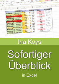
Often, Excel is used to evaluate given data. Which values are critical? Can I see at a glance what the development was like? Can I highlight a whole row if one column has important content? Or ask for the content of two cells, simultaneously? How do I get overview in a thick workbook? How do I get a clear and telling chart? Is there anything as clear, but not as large as a diagram? Can I ask Excel in natural language without any formula? All these questions are answered here.
Das E-Book können Sie in Legimi-Apps oder einer beliebigen App lesen, die das folgende Format unterstützen:
Veröffentlichungsjahr: 2023
Ähnliche
How to get
Instant Overview
In Excel 365 und 2021
Ina Koys
Short & Spicy, vol. 14
Contents
0 What we’re going to cover
1 Static colours
1.1 Sheet names and tab colours
1.2 The Table feature
2 Setting up your window
3 Keep control of your printout
4 Custom formats
5 Conditional Formatting
5.1 Using the wizard
5.2 Using formulas
6 Sparklines
7 Charts
7.1 Pie Chart
7.2 Column Chart
7.3 Line diagram
8 Talk with Excel!
9 More
For many users Excel is a tool to check results of something. Sometimes, simple numbers can explain themselves, sometimes one wants to convert them into graphics. We will look at several ways to get this done.
This booklet is about optics. We will cover some calculation alongside, but not really in-depth. That’s done i.e., in Queries, VLookup, XLookup & Co. and Roll away the boring stuff!, vol. 11 and 13 of this series.
All screen shots are done using Excel 365 in its current form. Like any other feature of Microsoft 365, they may gradually change in the future. At this point, it’s pretty much the same in Excel 2021, with hardly any optical differences.
If you’d like to download the sample data, you can do so clicking
www.shortandspicy.online
Enjoy your from now on more self-explaining workbooks!
Sheet names may not be rocket science, still are often ignored. It is not only about clearness of the screen view. They will also make it easier to understand relations and calculations.
One way to get a new sheet is clicking the Plus symbol on the right of the existing sheets. Any sheet can be renamed double-clicking the default name and typing in a new one. Then, to grant it the appropriate colour, right-click the sheet name again and pick a colour from the context menu. As long as the sheet is active, the selected colour will always appear somewhat pale. That’s normal and helps to keep overview, especially when calculating with different sheets.
If one then finds the line-up of sheets inconvenient or inappropriate, their order can always get changed with the left mouse button held down over the sheet name. Excel doesn’t care.
Not everything that for a human eye looks like a table is also a table from the viewpoint of Excel. As we begin to fill a worksheet with content and formattings, Excel regards this as a list or unstructured user input area. Often, this would be totally alright.
But most of the times, one has tables with a simple structure. If so, already the convenient visual features can save you a lot of work. Important in this case would be using table headers with only one row. Provided this, the table feature is the formatting way of choice. To apply it, click somewhere within the area of your future table. Then, from the Home tab, click Format as Table and select a design you like.

